CMYK vs RGB mistakes are one of the biggest reasons packaging projects experience delays, unexpected color shifts, blurry artwork, and costly reprints.
Let’s say you finally nail the design. The colors pop on screen, and your logo looks crisp. The file goes off to print. Then, the boxes show up, and that deep navy? It looks so gray and flat. What was supposed to be your vivid red logo looks dull and has a strange brownish edge. In many cases, the problem isn’t the printer but the file preparation process.
This guide covers what packaging prepress actually involves, how CMYK, RGB, and Pantone colors differ, and what has to happen to a file before it’s genuinely print-ready. By the end, you’ll know how to set up your own packaging prepress process so the final product matches what you designed the first time.
What Is Prepress in Packaging?
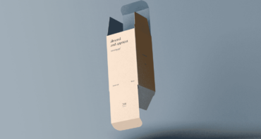
Prepress is everything that happens to a file between “design is done” and “ready for the press.” This is the stage where color mode gets checked, bleed gets added, fonts get outlined or embedded, and the dieline gets locked into place.
Skip prepress, or rush through it, and you’re gambling with the print job. A solid packaging prepress process catches problems on screen, where they’re free and easier to fix, before expensive materials reach the printing press.
Think of it as the bridge between design and theprinting process. Graphic design happens first, and prepress checks and prepares the file. The printing process turns digital files into printed packaging. Finishing, like foil or die-cutting, brings it all together.
A typical prepress packaging workflow includes:
Reviewing artwork files
Checking color mode settings
Validating dielines and dimensions
Verifying image resolution
Confirming bleed and safety margins
Generating proofs for approval
Color Modes Explained: CMYK vs RGB vs Pantone
Color is one of the most misunderstood parts of packaging production. Many issues begin when artwork is created in the wrongcolor mode.
CMYK (Print Standard)
CMYK stands for Cyan, Magenta, Yellow, and Key (Black). It’s asubtractive color model because it starts with white paper and “subtracts” brightness by layering ink on top. Several commercial print jobs run on CMYK files, packaging included.
Adobe’s owncolor management documentation covers the technical side of how these inks combine if you want the more in-depth version.
Design in CMYK from the start, and what’s on screen will look much closer to what comes off the press. But if you wait until the last minute to convert, then color conversion often creates unexpected results.
Neon greens and bright purples are usually the worst offenders. They look incredible in RGB, but disappointing in CMYK. That’s because the CMYK color mode physically can’t reproduce them with ink, no matter how the file gets adjusted.
Benefits of CMYK printing include:
Industry-standard print production
Accurate press simulations
Consistent color reproduction across large runs
Better control during the printing process
RGB (Digital Use Only)
RGB (Red, Green, Blue) is anadditive color model, per Figma, built for light and not ink. Screens, phones, and monitors all show images in RGB colors. It’s the default in most design software.
The issue is that RGB covers a wider range of colors than ink can physically produce. Send a printer an RGB file, and one of two things happens. The press software converts it automatically, with no control over how, or the file gets rejected outright. Either way, that’s not the predictable result anyone wants on a packaging run.
Common RGB problems in packaging include:
Bright colors appearing dull after conversion
Brand colors shifting unexpectedly
Inconsistent proofing results
Production delays due to file corrections
If your original design was created in Adobe Photoshop or another design platform using RGB settings, convert it to CMYK before finalizing your print-ready files.
Pantone (PMS) Colors
Pantone, or thePantone Matching System, solves a different problem than CMYK and RGB, which is consistency. Standard ink mixes can vary slightly between print runs and presses. Pantone colors are pre-mixed and numbered, so a specific shade of blue prints the same.
Many brands rely on Pantone colors because consistency matters. Abeverage brand orluxury retailer often needs the exact same brand colors across packaging, signage, labels, and marketing materials.
Pantone colors are commonly used when:
Brand identity requires strict color consistency
Packaging uses specialty colors
Corporate logos must match across materials
Premium packaging requires precise color control
Pantone also tends to be the better call for flat brand colors, particularly on smaller print runs like custom retail packaging, where exact color matching counts.
CMYK vs. RGB vs. Pantone: Quick Comparison
The choice between CMYK vs RGB or Pantone vs CMYK depends on how the artwork will be used and the level of color accuracy required.
CMYK
RGB
Pantone
Used for
Print
Screens or digital
Brand-critical colors
Color model
Subtractive (ink)
Additive (light)
Pre-mixed, numbered
Consistency
Good, varies slightly by press
N/A for print
Highest, locked by number
Best for
Printed items
Digital displays
Logos, exact brand colors
Beyond color accuracy, cost can influence which system makes the most sense for a packaging project.
CMYK is typically the most budget-friendly option because it uses standard cyan, magenta, yellow, and black inks that are already part of the printing process. Pantone colors generally cost more due to custom ink mixing and additional press requirements. RGB doesn’t have a direct print cost because it’s intended for screens rather than physical packaging.
For mostpackaging projects, CMYK is the standard choice. Pantone becomes valuable when exact brand color matching is required. RGB should remain limited to digital displays and previews.
Raster vs. Vector Graphics Explained
Graphics quality depends heavily on the type of artwork used.
Raster Images
Raster images are made up of pixels, which are tiny colored squares arranged in a grid. JPEGs and PNGs are raster formats. The catch is that raster graphic images are resolution-dependent, per theUniversity of Michigan Library. If you stretch a small photo to cover a large box panel, the pixels will start to blur or “pixelate” at the edges.
Vector Graphics
Vectors are built from mathematical formulas instead of pixels. This allows them to scale to any size without losing quality, according to theFree University of Berlin. Logos, icons, and most graphic elements in apackaging design should live as vector files, typically AI, EPS, or SVG. A vector logo looks just as crisp on a small lip balm tube as it does blown up on a six-foot retail display.
When to Use Each
Use vector graphics for digital illustrations and detailed graphics, like in logos, typography, line work, or icons. Raster handles photography and anything with complex shading or texture, or images with high resolution.
Resolution & Image Quality
300 DPI (dots per inch) is the standard for print. Drop below that, especially under 150 DPI, and images start looking soft or blocky once they’re printed at full size. A photo that looks sharp at 72 DPI on a laptop screen can turn noticeably blurry once it’s scaled up to cover acereal box’s front panel.
Common issues caused by low resolution include:
Pixelation
Soft edges
Blurry text
Poor image detail
To check image quality before sending a file off, open it at 100% zoom and compare the actual pixel dimensions against what’s needed at 300 DPI for the final print size. If the math doesn’t add up, you likely need a higher-resolution image.
Commercial printing relies on a standard halftone screen ruling of 150 lines per inch underISO 12647-2:2013.
Print-Ready File Checklist
Print-ready files should include a standard 0.125-inch (3 mm) bleed to ensure artwork extends beyond the trim edge. RGB color uses light on a black background to produce up to 16.7 million colors, creates smaller file sizes, and is best suited for digital and web applications.
CMYK is used for print, with colors measured in percentages and the “K” representing black to add depth and contrast, since combining cyan, magenta, and yellow (CMY) alone produces a dark, muddy brown or black.
Before submitting artwork for production, run through this checklist.
Essential Checklist
File is set to CMYK color mode, not RGB
Bleed and margins are applied correctly for the dieline
Images are 300 DPI or higher at final print size
Fonts are outlined or embedded
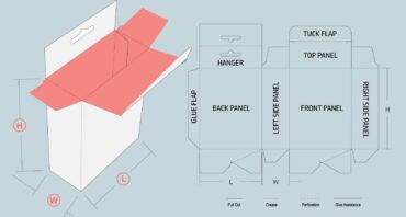
Dielines are properly applied, being a separate, clearly labeled layer instead of flattened into the artwork
The final file is exported as a print-ready file (PDF or AI)
Common Errors to Avoid
Missing bleed, which leaves a thin white line once the box is trimmed
Wrong color mode, which tends to happen when you design in RGB and convert too late
Unembedded fonts that substitute or reflow on a different machine
Artwork that’s misaligned with the dieline, putting text or logos on a fold or glue flap
Bleed, Trim, and Safe Zones Explained
Bleed refers to the extra artwork that extends past the trim line, usually 0.125 inches on standard commercial print jobs. That extra bleed area means a slight shift during cutting won’t leave a thin unprinted sliver along the edge. The trim line marks the actual finished size of the box panel.
Inside the trim line sits the safe zone, which is typically another 0.25 inches in. This is where text and logos should go so they’re never at risk of getting clipped.
Crop marks and trim marks tell the printer exactly where to cut. If you skip them or get the bleed area wrong, the final product can come back with crooked edges or cut-off text.
How to Prepare a Packaging File for Print (Step-by-Step)
Design in CMYK. Setting the correct color mode at the beginning helps prevent conversion issues later.
Use vector graphics for key elements. Logos, icons, typography, and line-based artwork should remain vector-based whenever possible.
Apply the dieline correctly. Yourdieline represents the packaging’s structural shape. Verify that all artwork aligns with folds, cuts, and glue areas.
Add bleed and safe margins. Extend backgrounds into the bleed area, keeping important information inside safe zones.
Export a print-ready file. Export using approved settings and preserve press-quality output.
Review the final proof before submission. Always review the proof before approving production. This can help save you thousands in production waste.
Common Packaging Prepress Mistakes
Designing in RGB and converting to CMYK only at the very end
Using low-resolution images stretched well past their native size
Ignoring dieline constraints like fold lines and panel bleeds
Skipping the final proof review entirely
Prepress & Color Accuracy Support with Refine Packaging
A solid packaging prepress process is half art, half technical checklist, and most brands don’t have a designer on staff who lives in Adobe Illustrator or Photoshop every day. Refine Packaging helps fill that gap.
Print-Ready File Assistance. Send over a file in whatever format it’s in,n and our team converts it to CMYK. We’ll also fix the resolution and build the correct margins so it’s 100% print-ready.
Color Matching Expertise. Our team supports Pantone and custom color matching, ensuring you get dependable results across packaging runs.
Dieline & Layout Validation. We validate artwork placement, fold locations, cut lines, and structural requirements before production approval to prevent costly production errors.
Proofing & Sampling. Digital proofs help identify layout issues early. We can also provide physical proofs to validate color accuracy and print quality.
End-to-end Prepress Support. From design review through final manufacturing, our prepress specialists help ensure packaging files are fully print-ready.
For high quality printing, graphic designers should prepare artwork at the correct size to ensure the next print project is produced accurately and efficiently.
Get your packaging ready for production with expert prepress support.Request a custom quote orstart with a sample to validate your design, colors, and print quality.
Get Expert Help with Print-Ready Packaging
Color and prepress problems are almost always preventable, and agreat package design still needs proper technical preparation before it reaches the printing press.
Color mode selection, image quality, vector graphics, bleed settings, and file formats all influence the final product. Small mistakes can lead to color mismatches, production delays, and unnecessary costs.
If you’repreparing packaging artwork and want an experienced team to view your files, we at Refine Packaging can help. Request a quote orget a sample to verify color accuracy and print quality before moving into full production.
Amanda is a professional writer and brand strategist at Refine Packaging who is based in Los Angeles, California. With a background in writing and journalism, Amanda entered the manufacturing industry 6 years ago to explore her unique passion for beautifully conceptualized packaging. With years of packaging experience, Amanda has a deep understanding about how brand psychology and box design trends impact emotions and desired actions. When she’s not writing, Amanda can be found snuggling her two Beagles or outdoors sipping on sparkling white wine.


 Alex Jasin
 Asif Muhammad


 Erica Campbell

.svg)
Share