Color creation is a diverse process, varying according to the medium used. It also involves different color models, each with its color range or gamut. RGB is one of these color systems. Short for red, green, and blue, the RGB color representation method emerged with the advent of the electronic age. It explains how color works on display devices such as TV sets, digital cameras, and computer monitors.
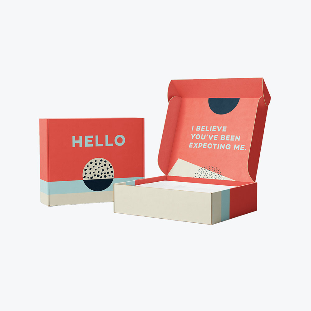
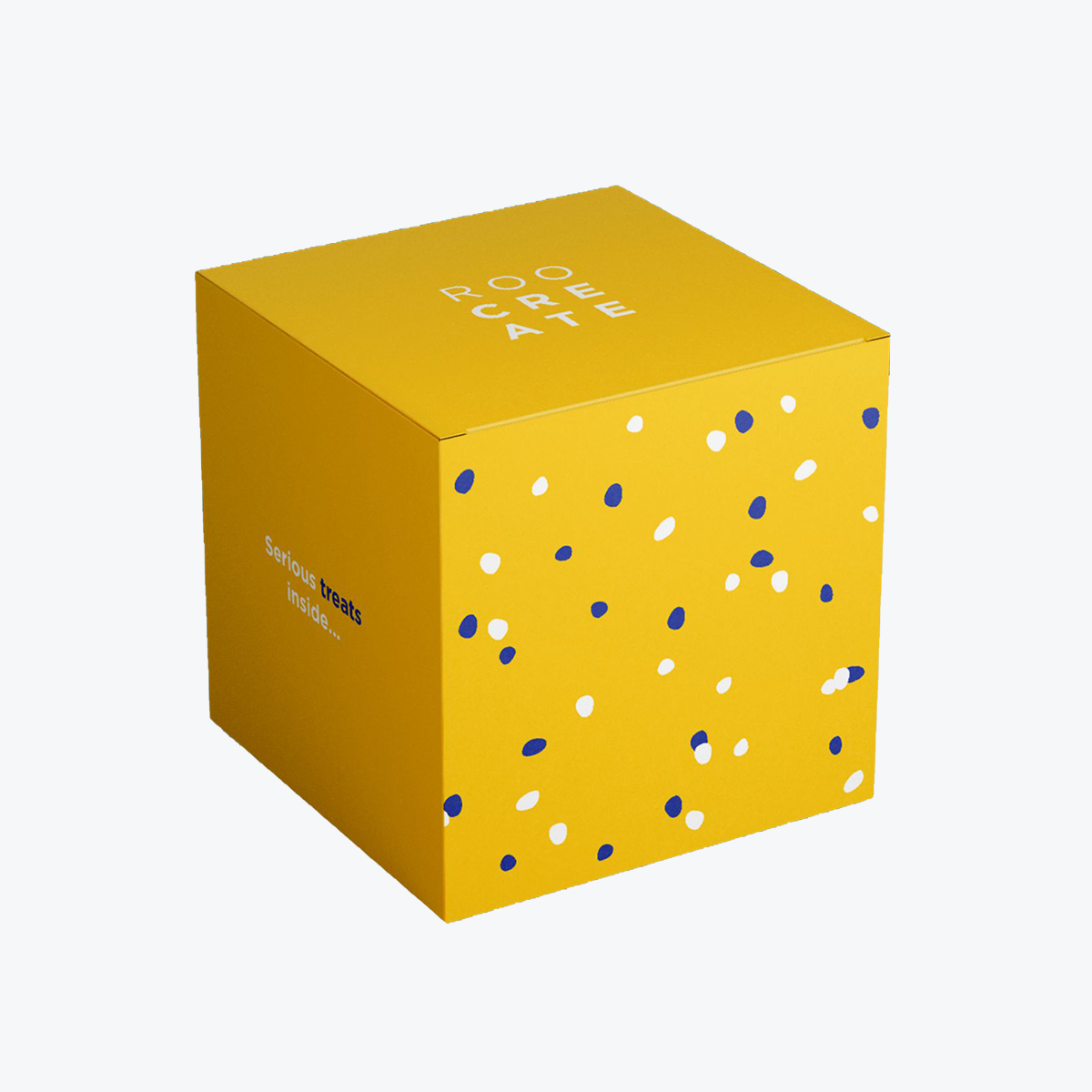
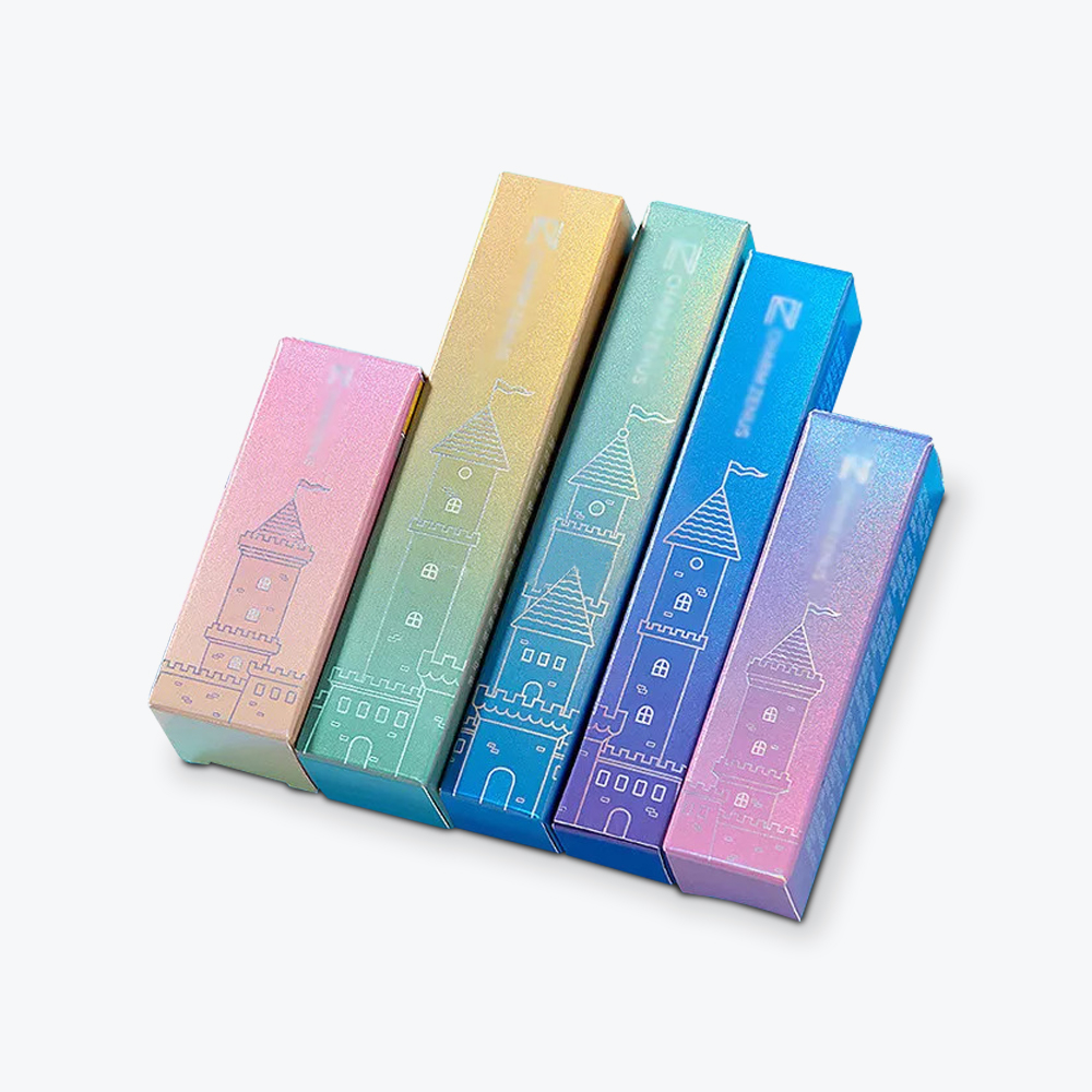
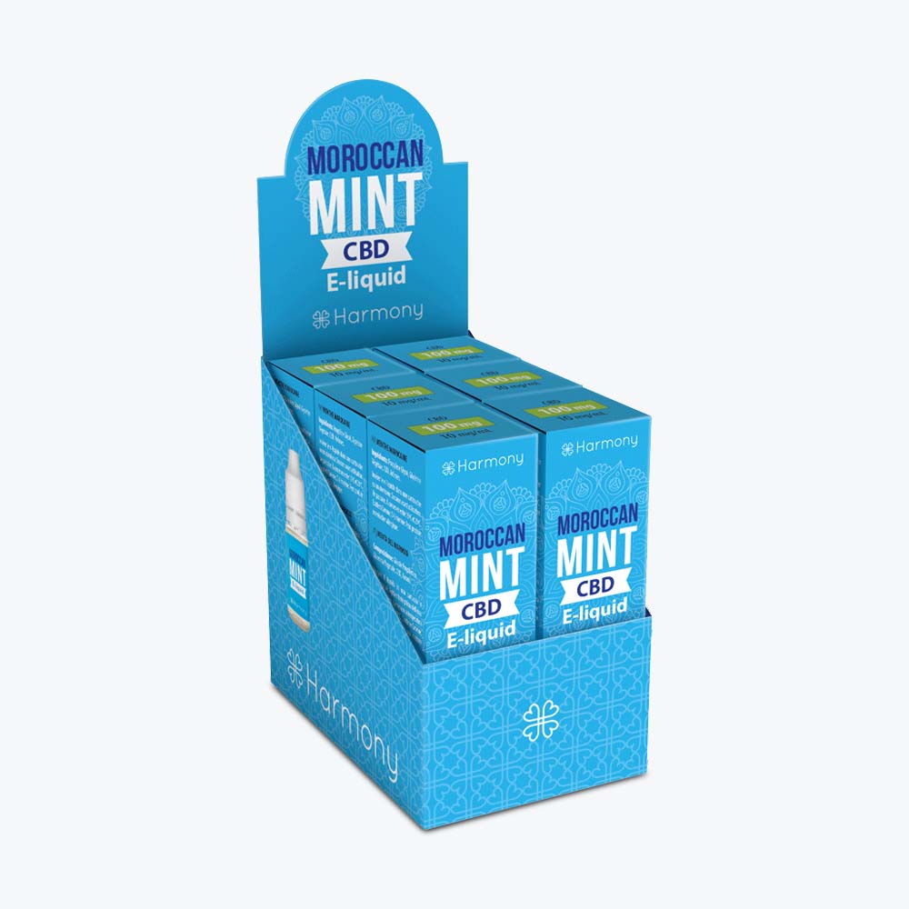
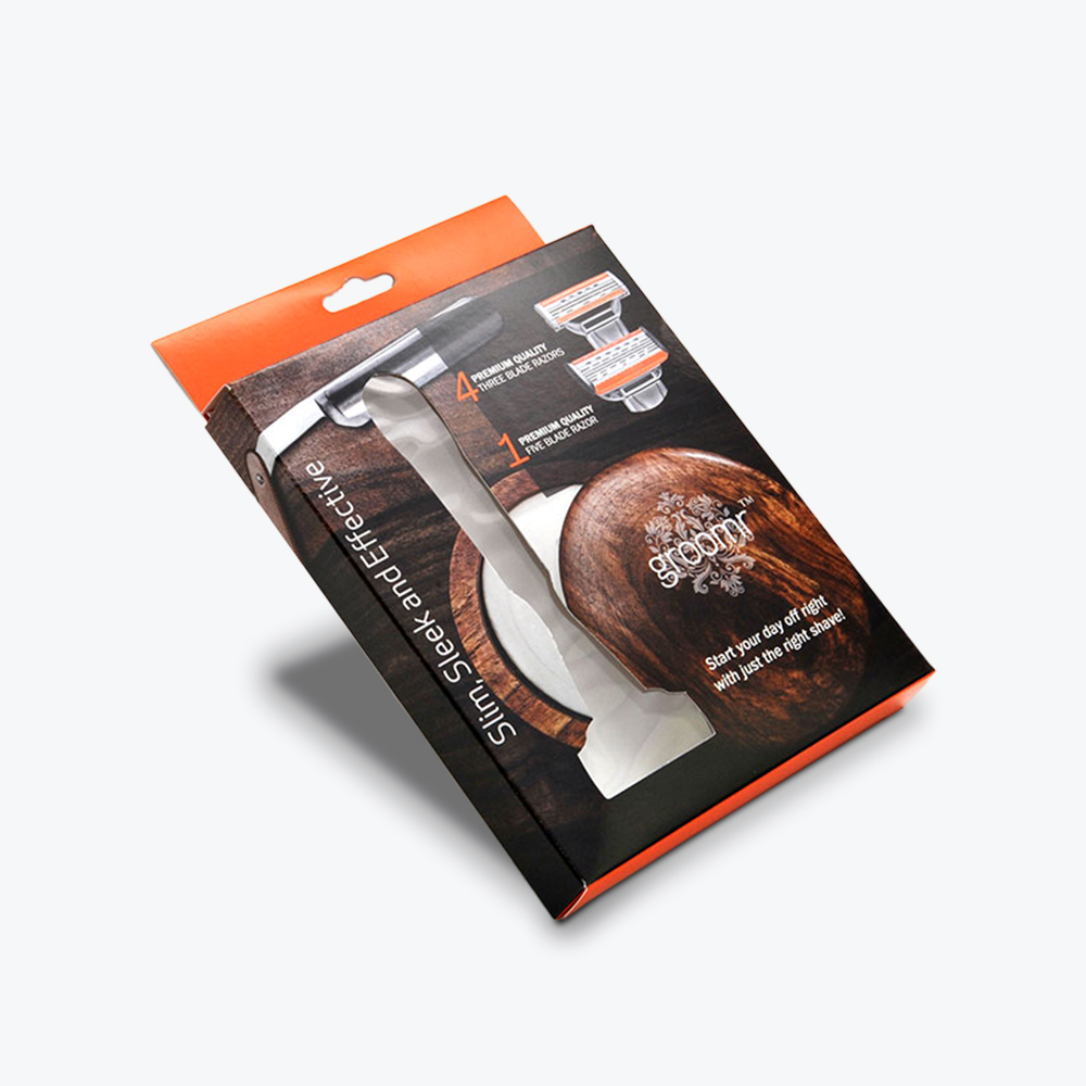
Starting your packaging design and preparing the file for your printer are some of the best times to understand the RGB model better. Whether your project involves a custom cosmetic box,display packaging, or retail box, read on and discover how to use this color space for your printing needs.
Quick Take: What is the RGB Color Model?
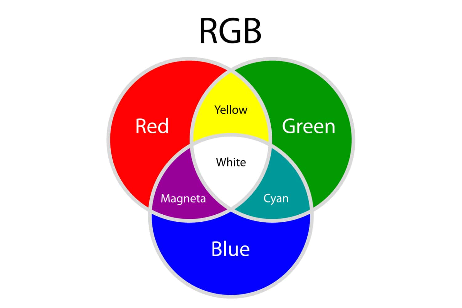
The RGB color model is an additive color model where the primary colors or light units – red, green and blue – are combined in multiple ways at different levels of intensity to produce a vivid and wide range of unique colors (known as “additive mixing”). RGB is typically used for digital graphics, where the images will only be seen on screen.
How RGB Works
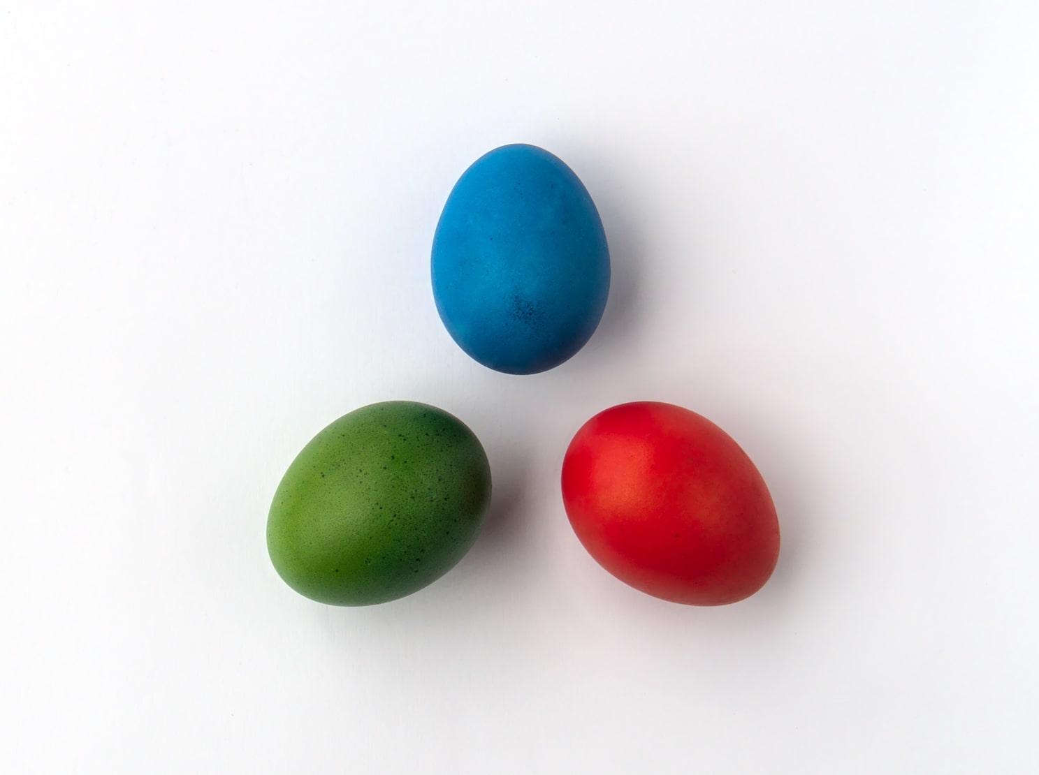
As kids, we learned that red, blue, and yellow were the primary colors for producing new hues. But digital colors—or colors emitted by electronic monitors that allow us to see images—don’t work the same way.
The RGB system involves mixing different colors of light. Each color’s light intensity ranges from zero to 255. Each color has 256 values (including zero), resulting in 16.77 million available colors. The color mode ranges from warm orange to cool blue.
On digital screens, tiny dots called pixels form an image, with each pixel consisting of red, green, and blue light units.
RGB as an Additive System
In the RGB color model, adding or combining the primary colors or light units produces a more vivid or brighter color.
The light source changes the brightness level of each primary color within a pixel to create unique colors. Mixing two basic colors at full intensity produces cyan, magenta, yellow, and black—the primary ink or pigment colors.
Blending red, green, and blue light at optimum capacity or equal intensities produces white light. Meanwhile, you get black when with the absence of light. In between these extremes, combining two or three primary colors—each with a different intensity—produces the entire color gamut.
Best Applications for RGB
Manipulating light to produce desired RGB colors happens in the digital space. Thus, the RGB mode is best for:
Branding (online logos and online ads)
Web and app design (graphics, buttons, and icons)
Visual content (photography for website, apps, and social media, video, and infographics)
Social media (profile picture and profile backgrounds)
Scanning documents
Why RGB Isn’t Ideal for Commercial Printing
You can print an image set in RGB mode without making changes because today’s inkjet or personal printers have software that automatically converts them to CMYK. But the printout may be different—typically duller or less vivid—than how the colors appear on your screen.
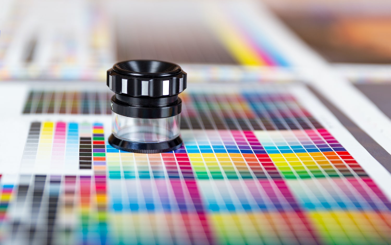
Converting the file to CMYK using an image editing solution is still the best option. Besides, most professional commercial printers will ask you to convert your file from RGB to CMYK before they print.
Image editors such as Photoshop, Illustrator, and CorelDraw allow you to preview how your image,pattern, or design will look on paper. Moreover, such software lets you tweak your image if its appearance is way off the RGB version.
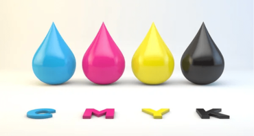
Understanding CMYK in Packaging and Print
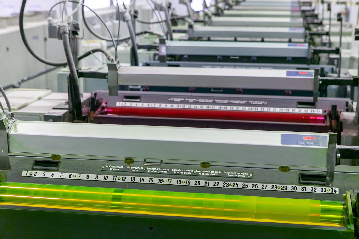
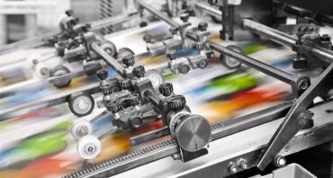
CMYK stands for cyan, magenta, yellow, and black—the four ink colors used by mostoffset printing machines, such as those by Refine Packaging. In offset printing—whose market was worth$649.9 million in 2022, your design or image undergoes color separation. This process involves four plates receiving a calibrated amount of each CMYK ink. Each plate offsets the image to a rubber blanket, which then applies the ink on the material. When the four-color process is complete, the overlapping colors produce a single image of your original design or photograph.
Based on RGB’s additive nature, increasing your color’s intensity brings you closer to white. Meanwhile, the CMYK model is a subtractive process—inks “subtract” brightness from white or a blank surface. Adding different colors of pigment or ink to a surface will give you a darker result. However, CMYK has a smaller 16,000-color range compared to RGB.
Due to these differences, printouts can’t accurately represent the bright colors in designs created or photos captured using the RGB mode. Images can appear “washed out,” especially if you have “out of gamut” colors, such as neon, fluorescent, and metallic hues. You may have to make test prints and customize settings to get specific tones right for your printout.
Here’s a chart summarizing each color system’s unique traits:
Color Mode Traits
RGB
CMYK
Number of colors
16.7 million
16,000
Color source
Light
Ink
Usage
Screen viewing, lighting for photo shoots
Printed materials
Examples
Websites, mobile apps, social media, online ads, TV programs and commercials, movies
Process color is another term for any of the inks in the CMYK system. In process printing, the four colors combine after the machines apply CMYK ink to your material one at a time.
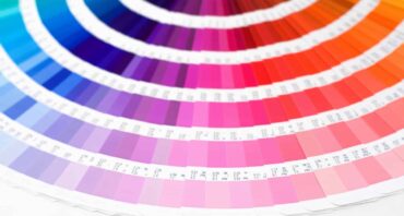
Because color consistency is important in branding, printers use additional colored inks to achieve a closer match to spot colors. These colors are typically unique to one’s brand and chosen from thePantone Matching System (PMS). Printers use them pre-mixed—they blend inks before printing. Pantone uses 18 base inks to create all the colors of this color model.
Some offset printing companies use an extended gamut—CMYK + OGV, which stands for orange, green, and violet—to simulate most of the PMS colors—and closer to the digital or RGB version of a brand’s design.
How to Verify if Your Image Is in RGB Mode
Here are the steps for checking what color mode yourdesign or image is in:
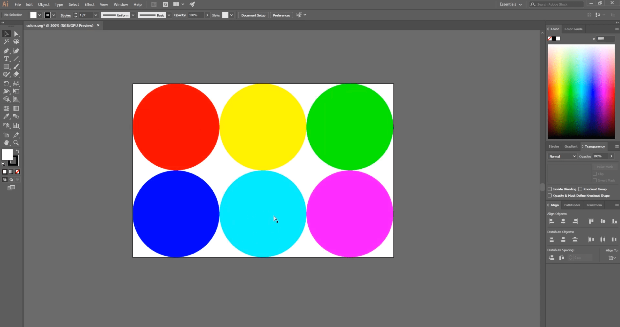
Illustrator: Go to File in the main menu, then select “Document Color Mode.”
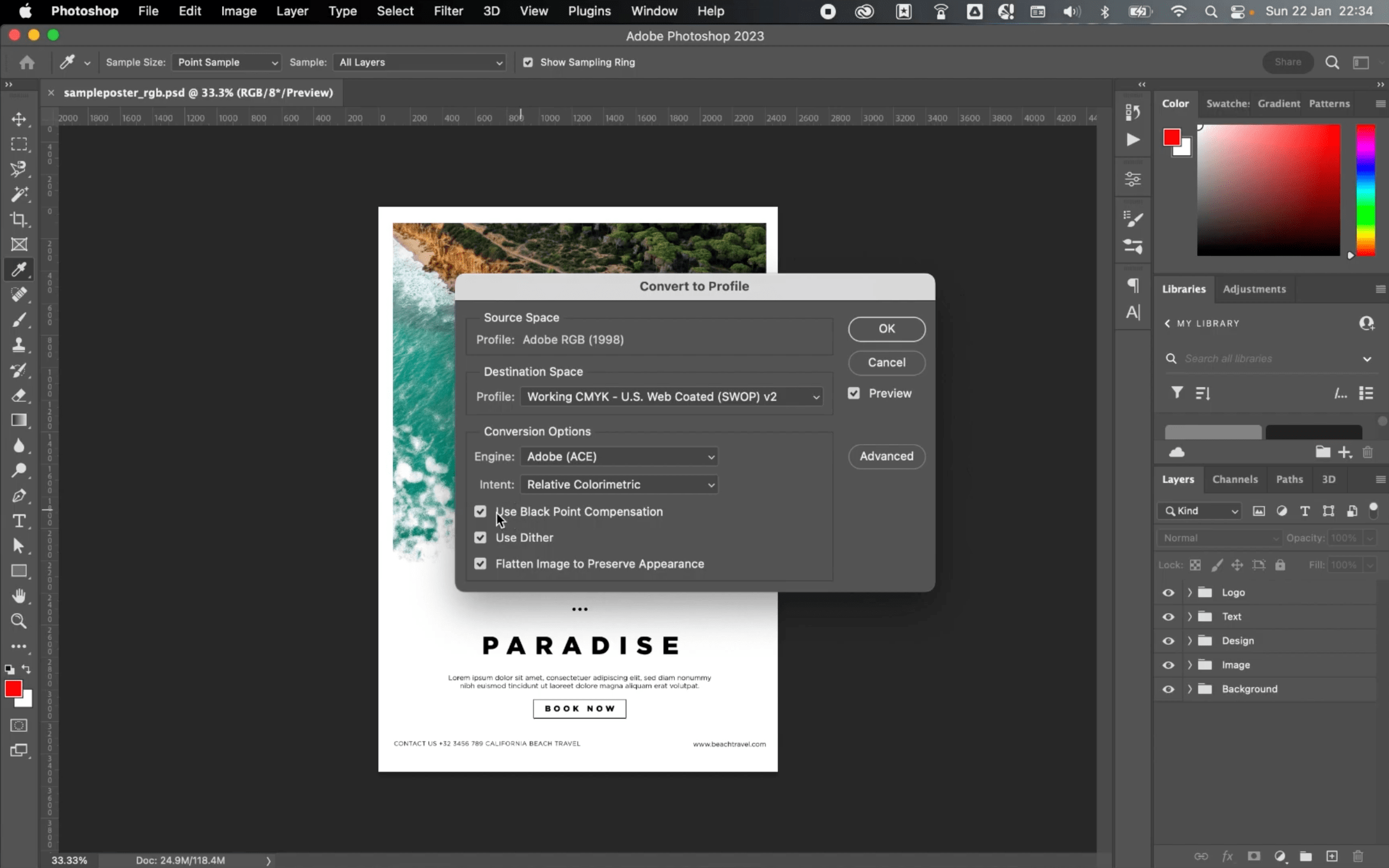
Photoshop: Go to Image in the menu bar, then click “Mode” and search for the color profile with a check in the panel that appears on the right.
InDesign: Go to Window, then tap “Color” from the drop-down menu to bring up the color panel, which shows colors measured in percentages. You’ll find RGB percentages if you’re in RGB mode and CMYK percentages if you’re in that mode.
Prepress Process: Preparing Your File for Printing
The prepress stage—or the steps in preparing your packaging design for final production—is crucial in ensuring that the finished product accurately reflects your original vision and branding.
For business owners andpackaging designers, this covers creating the design, saving your file based on your printer’s specifications, and making a hard copy or printout of the design (proof). Proofing allows you to make corrections or adjustments and show your printer or box manufacturer a printed version that’s closest to your desired look.Let’s go through each step:
1. Ask your printer for the required file resolution and format for printing your design
Most printers require high-resolution (300 dpi or higher) graphics and images with clear and legible fonts. File saved at 72 dpi—the typical resolution of pictures and text on computer monitors and smartphones—will look blurry or pixelated when printed.
Also, inquire about what file format to use in saving your design. The most common file types used in printing include:
PDF (Portable Document Format)
You can view PDFs on almost any platform and device, making it a flexible format. It preserves the formatting and layout of graphics (raster and vector), fonts, and text.
EPS (Encapsulated PostScript)
An EPS file is a vector-based format, allowing you to scale your artwork infinitely (into smaller or larger sizes) while retaining its quality. However, image-editing software is necessary for opening and editing EPS files.
AI (Adobe Illustrator)
Another vector-based file type, AI is the native format for designs and graphics created in Illustrator. Like EPS, AI supports transparency and special effects. The majority of the Illustrator software’s users come from the US (42.17%), followed by the UK (8.54%), and Germany (5.29%).
The Adobe product line dominates the graphic design software sector worldwide, with a43% global market share.
Check your screen’s brightness, white point, and contrast index or gamma. Doing so will reduce the disparity between your design’s appearance—on your computer screen and a test print, particularly its luminance or brightness.
The most commonly recommended brightness for prepress work is 100 candelas per square meter. This is the standard unit of measure for monitor brightness, although the acceptable range is 80 to 120 cd/m2. Meanwhile, the recommended white point—or setting that determines the color temperature (warmth or coolness of light) of the brightest white—for CMYK reproduction is 5000 Kelvin or D50 and 5500K or D55. Monitors generally have high default or factory settings of D65, which is acceptable for images you’ll use and display online. As to the gamma levels, the range is from 1.8 to 2.2.
Besides these internal controls, you can also use monitor calibration hardware, such as Datacolor’s SpyderX Pro, X-Rite i1Display Pro, or Calibrite’s ColorChecker. These colorimeter or light-sensing devices measure the transmission of light or your monitor’s output.
Calibrators have apps that automatically adjust your display to meet a color profile. Some devices also assess your ambient light, which is useful when the light source in your work environment doesn’t change. Otherwise, it’s best to turn off this feature.
3. Generate a soft proof
Soft-proofing is using your monitor to view how your design—particularly its colors—will appear when printed out. It’s not perfect, but it’s better than guessing or hoping for a nearly accurate outcome.
To determine how your design will look in CMYK, convert your file to that color mode. Here’s how:
Adobe Illustrator
Go to Files and select “Document Color Mode,” and click CMYK as shown in this video tutorial.
Adobe Photoshop
Go to Edit, click “Convert to Profile,” and pick CMYK in the Destination Space as shown in this explainer video.
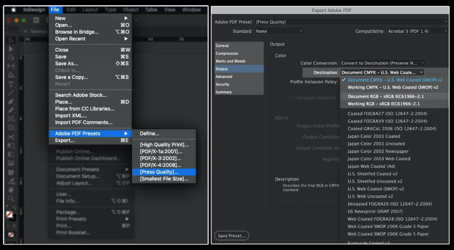
Adobe InDesign
Go to File, click “Adobe PDF Presets,” and tap “[Press Quality].” Save the file and in the pop-up box that emerges, click “Output” and then choose CMYK in the Destination dropdown menu.
Select the correct material for your test print
If you wish, you can do a test print of your design to show to the printer. Use midrange to premium paper resembling your packaging material to see how the colors will show on a surface with a similar texture. Your chosenpaper type and ink quality affect the appearance of your hard proof, so be sure your cartridges have enough ink.
Later, you can ask your printer if they can produce a prototype before mass production. At Refine Packaging, we includemockup creation in our client’s printing journey with us.
Statista’s latest data shows that paper and cardboard enjoy robust sales, cornering33% of packaging material demand worldwide. Flexible plastics are close behind at25.5%.
Investing in Colors Unlocks Business Opportunities
Choosing a high-quality and seasoned printing company to produce your packaging is a wise investment to ensure uniformity in your brand colors online and offline.32% of consumers say that visually appealing and gift-like packaging encourages them to post images or videos of products onsocial media. Thus, product packaging can open doors, whether it’s a greater online presence through user-generated content or wider brand awareness throughad campaigns. Increased brand awareness can lead to ROI growth from at least5.5% to820% in some cases.
When comparing printers, research online testimonials and feedback about them. Request packaging samples to get an idea about the company’s capabilities.
Refine Packaging’spartner brands can attest to our team’s customer service success and eye-catching customization using our offset printing process. Upon your request, we can send you asample from our past projects if you want to check our work quality. Our team can also produce a custom sample of your packaging before production.
Still figuring out your custom packaging options? Our in-house design team can help you decide, including exploring label and sticker applications if you prefer customizedfold-and-assemble stock boxes or single-color packaging.
Refine Packaging is the top choice for the world’s Inc 5000 and Fortune 500 companies. With super fast production times, affordable pricing, and a sky’s the limit attitude, we’ll help you turn your custom packaging into a competitive differentiator. Contact us today and a dedicated packaging specialist will guide you through every step of the custom packaging process without breaking a sweat.
Amanda is a professional writer and brand strategist at Refine Packaging who is based in Los Angeles, California. With a background in writing and journalism, Amanda entered the manufacturing industry 6 years ago to explore her unique passion for beautifully conceptualized packaging. With years of packaging experience, Amanda has a deep understanding about how brand psychology and box design trends impact emotions and desired actions. When she’s not writing, Amanda can be found snuggling her two Beagles or outdoors sipping on sparkling white wine.


 Amanda Jane Rivera
 Asif Muhammad
 Erica Campbell


.svg)
Share