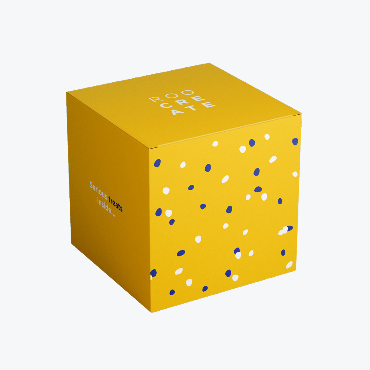
Great ice cream packaging needs to balance function and fun—it should preserve freshness, prevent leaks, and make your brand stand out in the freezer aisle. Top ideas include custom pint containers, tamper-evident seals, bright color palettes, playful illustrations, and eco-friendly materials.
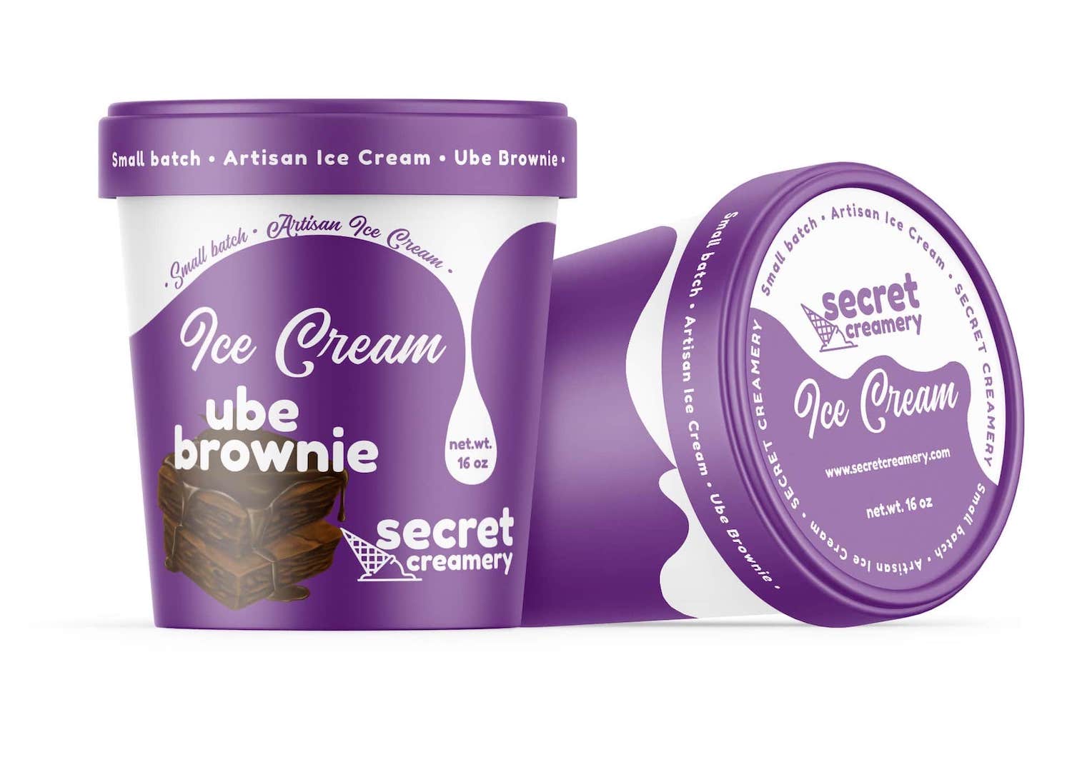
Custom printed pints or tubs with moisture-resistant coatings
Eye-catching colors and graphics to pop on cold shelves
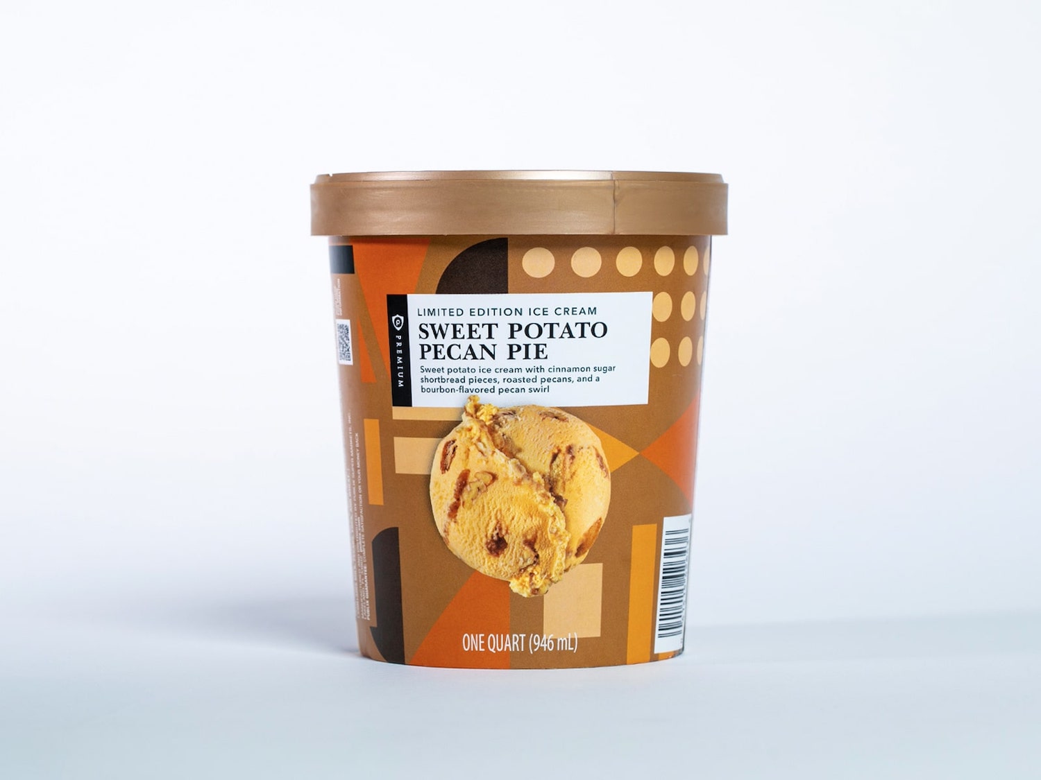
Limited-edition or seasonal designs to boost engagement
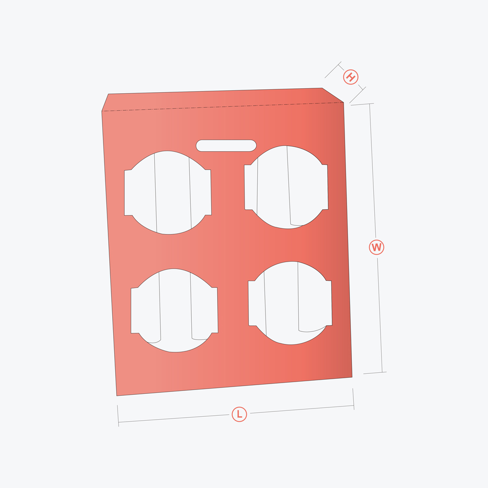
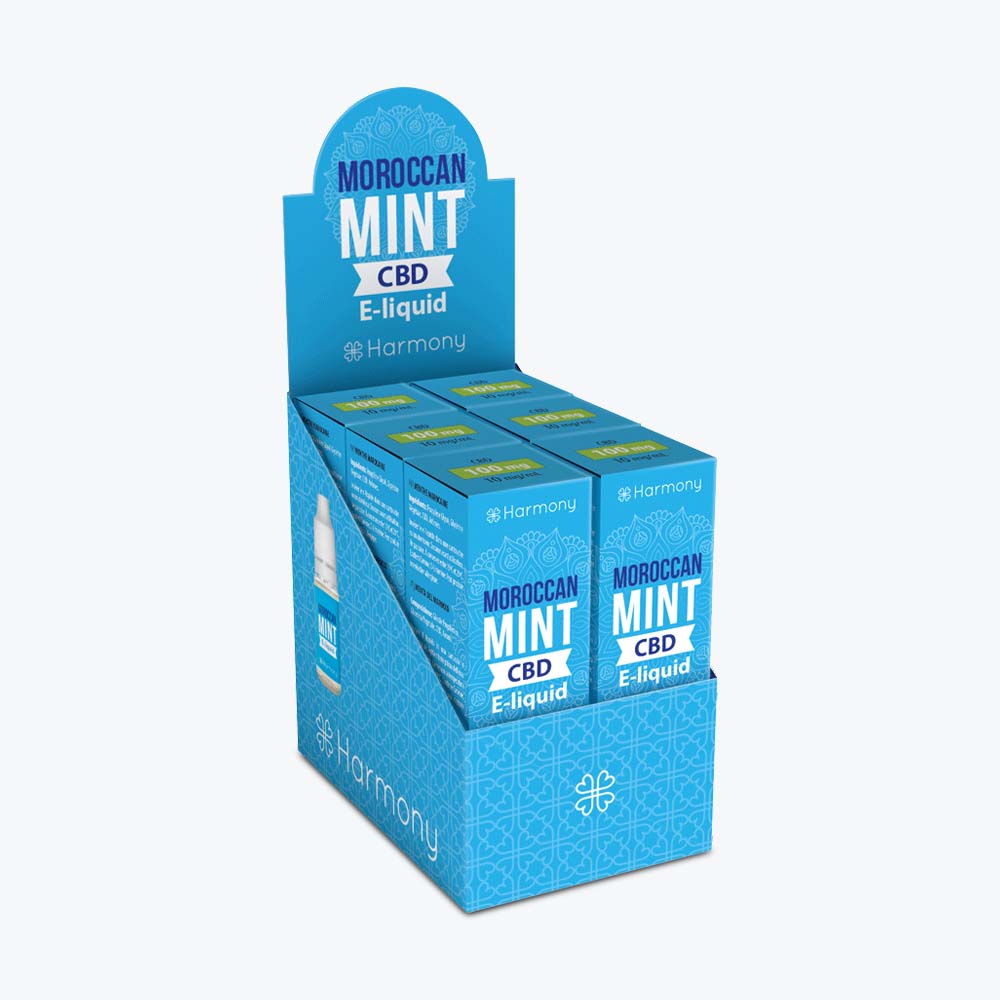
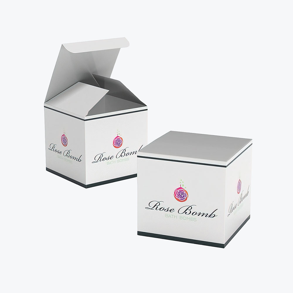
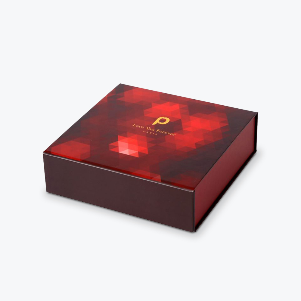
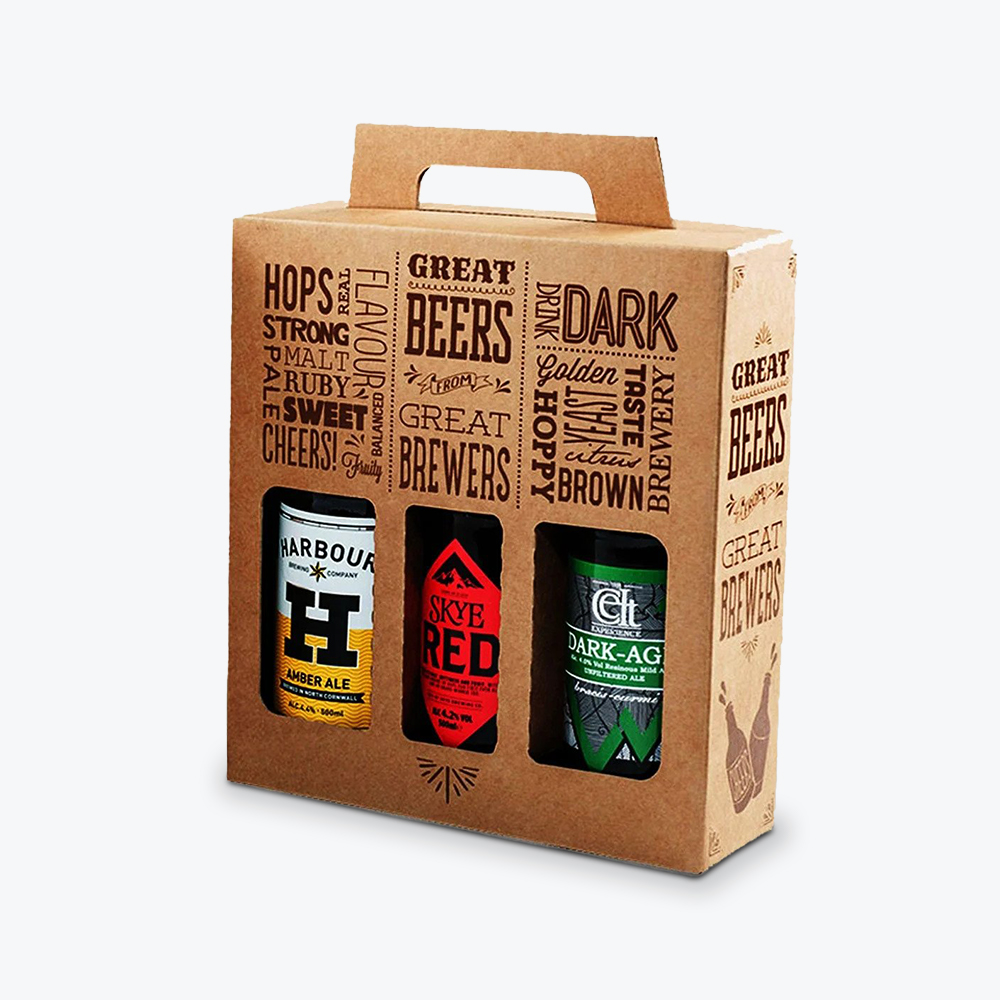
Refine Packaging offers custom packaging solutions that help ice cream brands showcase their identity while keeping products secure and compliant. Their team can help design printed containers or secondary packaging like custom cartons for multi-packs or gifting.
Custom box printing with food-safe finishes
Eco-conscious material options available
Free design support and fast quotes
Great for DTC brands, retail, or seasonal promos
Trusted by food & beverage companies for high-quality packaging
We all scream for ice cream, but what makes us choose one brand over another?
Captivating custom packaging plays a huge role. In 2025, the revenue in the ice cream market will reach$109.20 billion. In this vast competitive market, great taste isn’t always enough.
Your ice cream packaging must stand out and make customers crave frozen treats. Optimal packaging guarantees your ice cream maintains its creamy, delightful texture while telling your brand story.
Why Ice Cream Packaging Matters
Delicious as it may be, storing ice cream isn’t like tossing a box of cereal in the cupboard. It’s a frozen product, so regular packaging won’t work. Ice cream containers need to be specific to keep the treats tasty, looking good, and safe to eat.
Here’s why ice cream packaging matters:
Defeats Freezer Burn: No one likes ice crystals messing with their ice cream. Good packaging stops air from ruining your dessert, keeping it smooth and delicious.
Mini-Billboard: Your ice cream container is like a tiny ad. Catchy designs and logos grab attention in the freezer aisle.
Safety and Protection: Ice cream is a delicate treat. Sturdy packaging means less risk of squished pints and melted messes.
Flavor Saver: Your chocolate ice cream shouldn’t taste like last week’s fish tacos. Good packaging keeps different freezer smells from spoiling your treat.
How to Choose the Right Ice Cream Packaging
Different types of ice cream are available worldwide, including ice cream rolls, sandwiches, cakes, and more. Each product requires a practical and distinctive ice cream packaging design to set it apart and capture attention.
1.Understand the Target Market
Identify your target audience first. Are you aiming for adults with sophisticated tastes? Kids who love bright colors and fun? Families looking for value-for-money treats?
Here’s what to consider about your target market:
The Basics: Age, income, where they live, all of this matters. A fancy, expensive pint of ice cream won’t appeal to the parent buying five tubs on a tight budget.
What’s Inside Their Head: Are your customers health-conscious? Love trying wacky flavors? Values, attitudes, and lifestyles tell a detailed story of your buyer’s persona.
2.Analyze the Market and Competition
The ice cream packaging market is projected to reach approximately$1,123 million by the end of 2030. Ensuring that your packaging is attractive and practical is crucial. Don’t just limit yourself to the ice cream aisle for inspiration. Check out packaging trends for snacks, beauty products, and anything that catches your eye. You can also watch product-related videos likethis for ideas.
Here’s how to get a competitive edge:
Who’s Your Rival: Check out other brands that are similar to yours. Do they use the same color combinations? Target the same type of customer? Understanding your competition is vital. Check what works in their packaging and where you could do better.
Find the Gaps: What can you offer that no one else is? Perhaps most players in the market use the same kind of packaging, or there’s a lack of accessibility options for people with certain disabilities. Spotting these gaps could be your winning strategy.
3.Do Extensive Research on Packaging Materials
Your chosen packaging materials must mirror the product’s quality and showcase your brand’s value. It’s essential to consider the kind of ice cream you’re selling. Is it a sandwich, a scoop in a tub, or a gelato? Durability is also a priority. Ice cream packaging design should also meet strict food safety standards and need to handle freezing temperatures without damage.
Here are the usual selections:
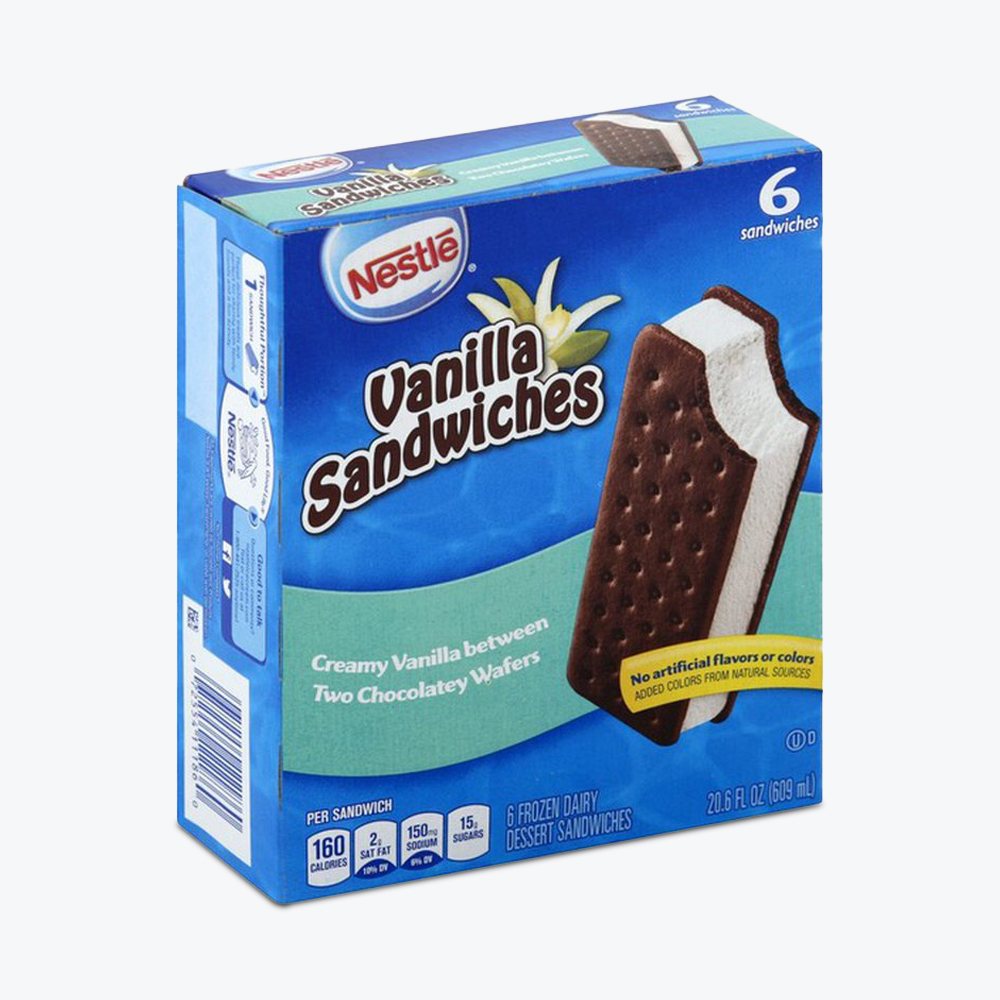
Individual Treats:Ice cream sandwiches or ice lollies usually come in plastic or paper wrappers, otherwise in cardboard boxes.
Multi-packs: These often use cardboard or paper boxes for easy stacking.
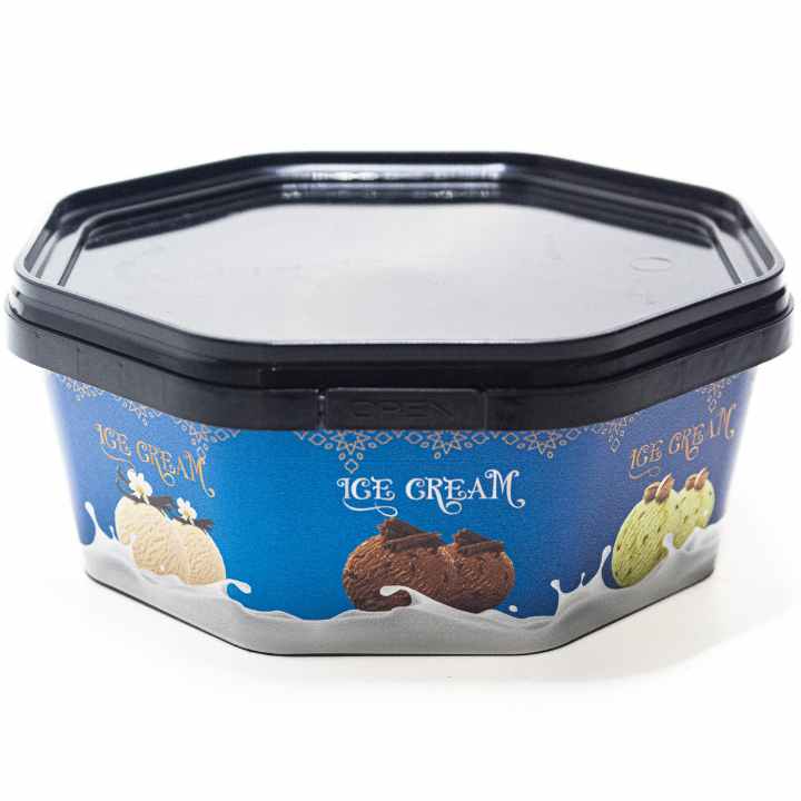
Scoopable Goodness: Plastic tubs or glass jars are the classic choice for scooping out your favorite flavors.
With ice cream packaging designs, aesthetics are necessary to attract consumers. Here are the key design elements to make your frozen delights fly off the shelves:
Color Palette
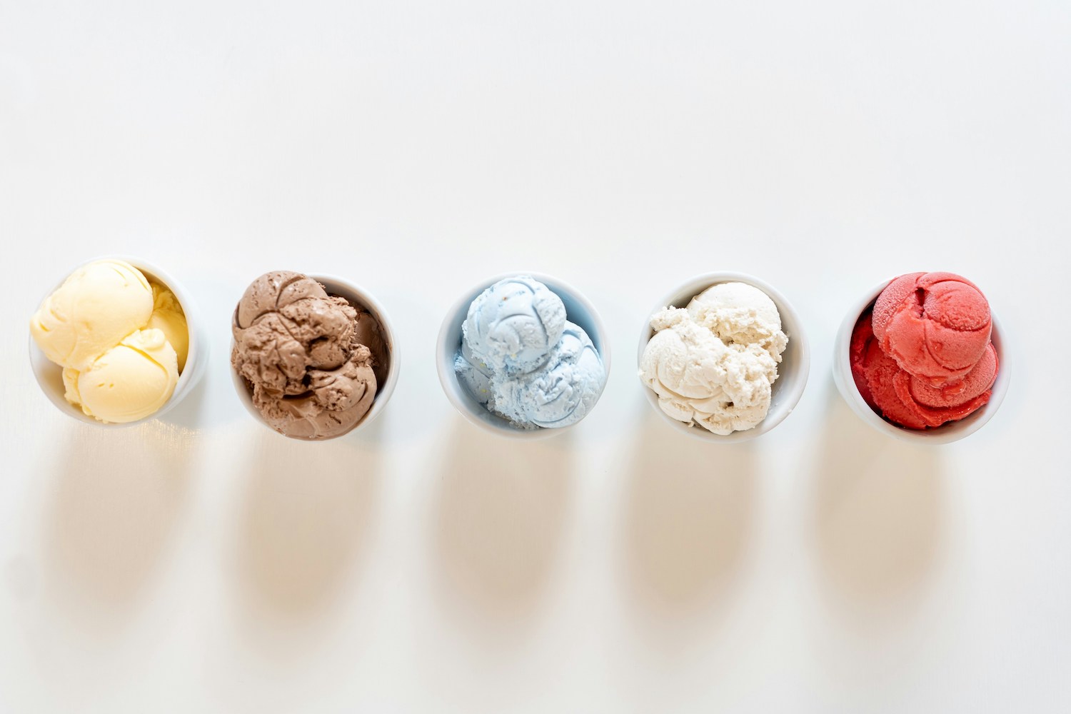
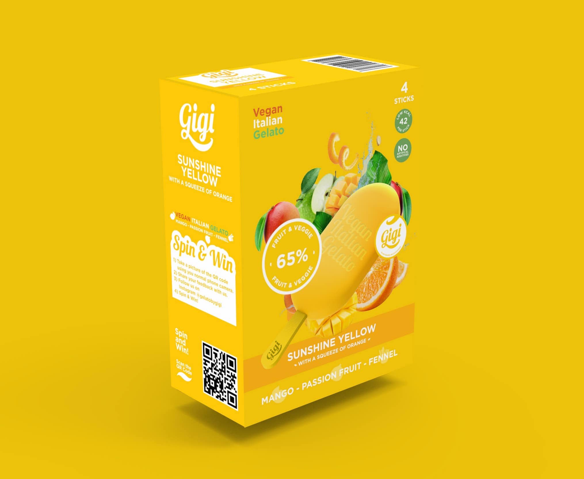
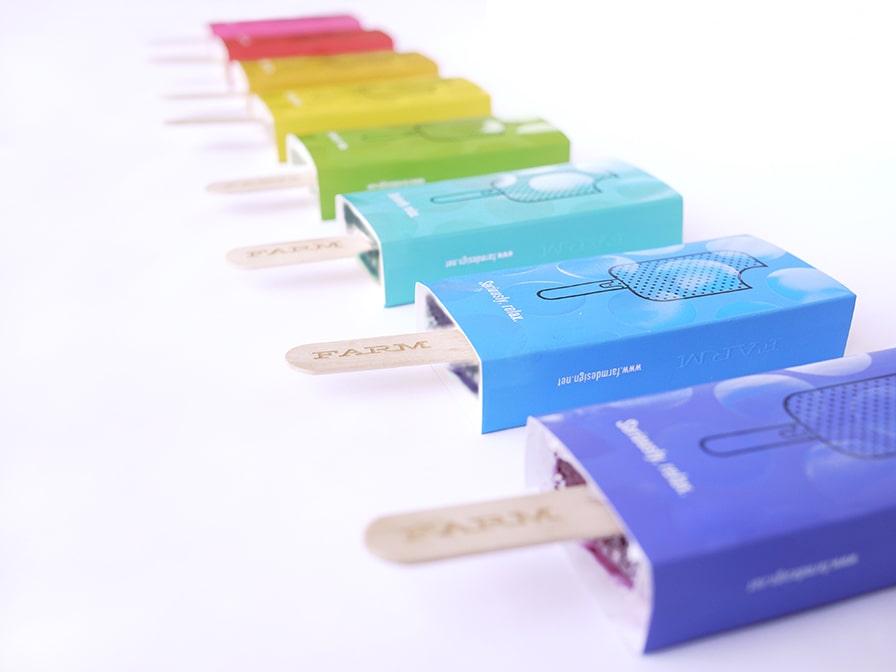
The first thing customers notice on a package is color. It adds visual appeal and evokes emotions faster than words. Think about which color aspect you want to focus on. If you target kids, think of bold and playful colors. If you prefer to focus on the ingredients, you can use earthy tones for all-natural flavors. You can also align the color palette with the taste experience you offer. Think mint green for mint chocolate chip, pink for strawberry gelato, or sunny yellow for lemon sorbet. This helps customers find their favorite flavors quickly.
Font Selection
Yourfont choice tells customers what to expect. Is your ice cream fun and cheerful? Use a whimsical font. High-end ingredients? Go for something elegant. When choosing a font, focus on legibility for easy reading in a packed freezer section, even at a glance. You should also pay attention to the amount of text on the packaging. For instance, use minimal text for a custom ice cream cone sleeve holder to maximize space efficiency.
Here are examples of great fonts that’ll look great in ice cream packaging:
Classic but playful, it evokes cold treats and winter fun
Brands focused on winter holidays, traditional flavors with a modern twist, and packaging with a cozy, nostalgic feel
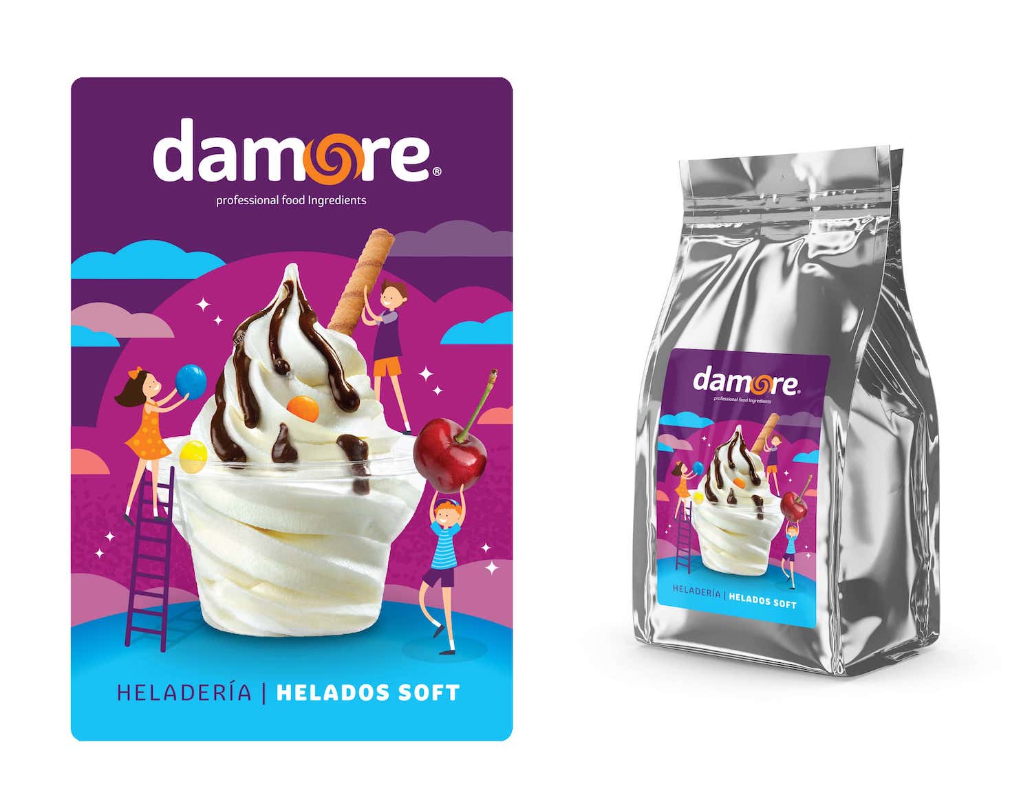
Imagery
The imagery used in your ice cream packaging design depends on your brand identity. You can go straightforward and use a mouthwatering photo of your ice cream, or you can add cute illustrations that reflect your brand’s personality. Highlight those creamy swirls, chunks of fruit, or drizzled chocolate; just make sure the photos are top quality and tempting.
Package Shape
The shape of the custom printed ice cream packaging conveys a specific message. Brands targeting young children often use round cups and popsicles, allowing for easy consumption. Large group servings typically come in tub-shaped boxes with wide openings. Unique shapes for individual treats can set you apart as long as they’re practical to store. The shape should complement the overall design and enhance the consumer experience.
6 Design Tips for the Best Ice Cream Packaging For Your Brand
The designs on ice cream cartons are as varied as they are colorful. But your packaging design needs to do two things at all times:
Keep your ice cream safe and easy to store.
Catch a shopper’s eye.
Here are some tips for crafting an effective ice cream packaging design:
1.Clear Flavor Communication
Ice cream is an experience. Your packaging needs to be so delicious-looking that people feel those cravings kick in before they open the box.
Keep it Crystal Clear: The flavor of your ice cream should be the first thing people notice. Customers must know what they’re buying in seconds, whether through bold letters, bright colors, or simple naming. This is key for effectivepackaging for marketing.
Flavor Visuals: A picture is worth a thousand words, especially if those words are “rich chocolate” or “creamy vanilla.” Use realistic photos, colorful illustrations, or playful patterns that show off those tasty chunks, swirls, or smooth textures.
Color Coding: Make it even easier for shoppers to spot their favorite by using color codes for different flavors. Vanilla variations are always in creamy tones, while chocolate swirls on deep brown backgrounds. A consistent color scheme offers instant flavor recognition.
2.Texture and Sensory Appeal
It’s not just what’s in the carton of ice cream—it’s how the carton feels that sets the stage.
Tactile Elements: Think of subtle textures that hint at what’s inside. A velvety matte finish? Raised lettering? Maybe fun embossed swirls reminiscent of ice cream scoops? Each touch tells a little story.
Frosty Imagery: Photos of your ice cream with a light dusting of “frost,” dripping condensation, or maybe even playful ice cube details are the way to go. Your carton of ice cream shouldn’t just look cold, it should feel cold.
Spot Varnishes: Add a luxurious touch with targeted spot varnishes. A shiny drip design against a matte background offers a visual and tactile contrast that’s hard to resist. It screams indulgence.
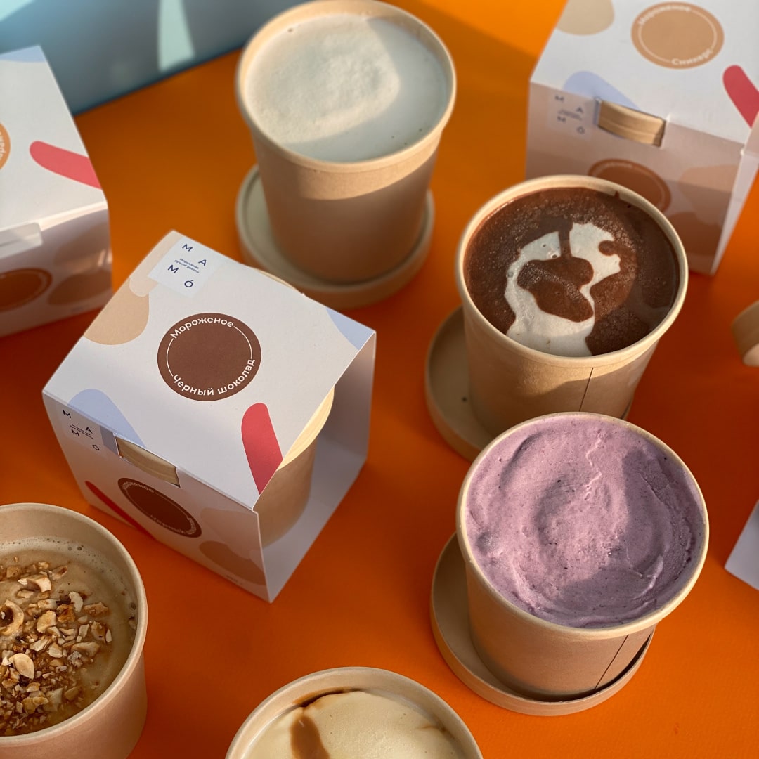
3.Eco-Friendly Materials
Market your ice cream and save the planet by consciously going green. This has the bonus of attracting environmentally-conscious consumers,43% of whom consider it an important purchasing factor.
Sustainable Options: Use eco-friendly packaging materials like compostable plastics to appeal to consumers of environmentally conscious products.
Minimalist Approach: Less is more. A clean, minimalist design not only looks modern but also reduces waste. Fewer inks, less material, and just as eye-catching.
Transparency: Include information on the packaging regarding materials used and responsible disposal methods to help shoppers make informed decisions.
4.Unique Shapes and Structures
The standard rectangular carton can start to look a little boring. Break the mold and make your ice cream the talk of the freezer aisle.
Think Outside the Box: Literally. Consider unconventional shapes—hexagonal, circular, or a waffle cone-inspired design. Unique structures catch attention and stand out on the shelf.
Functional Shapes: Ensure that the shape serves a purpose. Maybe a handle for easy carrying or a foldable lid for resealing. Practicality with a cool design twist is always a win-win.
Interactive Elements: Incorporate playful elements like pop-up features, hidden messages, or even built-in spoons to engage customers and create a memorable experience.Custom packaging turns regular containers into a mini-adventure.
5.Storytelling and Brand Personality
Utilize your ice cream box to engage with your customers and build stronger connections.
Narrate the Journey: Use the packaging to share the recipe’s origin, the inspiration behind the flavor, or the family tradition that led to its creation. This makes your brand more “human.”
Brand Voice: Let your brand personality shine through. Are you quirky, nostalgic, or elegant? Align the design with your brand’s voice. Customers love feeling like they understand what a brand stands for.
Local Flair: Don’t underestimate the power of “made right here.” If your ingredients are locally sourced or you have a connection to your community, share it. This builds trust and adds a special touch that big brands can’t imitate.
6.Practical Considerations
Functionality should always be at the forefront of design. Even the most gorgeous container fails if it doesn’t do its job properly.
Freezer-Ready: Ice cream packaging should withstand freezer temperatures without compromising its integrity. That means no warping, splitting, or getting soggy.
Easy Open and Close: Nobody wants a struggle to open their ice cream container. User-friendly lids or peel-off tabs are essential for keeping everyone happy.
Portion Control: Consider designs that cater to different consumption habits. Single-serve portions offer convenience, while a resealable main container is great for scooping.
11 Design Inspirations for Ice Cream Brands
Whether you’re starting a new ice cream business or revamping the look of your existing line, finding the right ice cream packaging design is essential. Here are some design inspirations you can consider:
1.Text-Focused Design
Sometimes, simplicity makes the biggest impact on the ice cream box. Using bold, eye-catching typography is a great way to give your ice cream a clean and modern look. Focus on using rounded fonts and lettering styles like bubble letters to convey a sense of cheer and whimsy. These friendly fonts project an approachable vibe. Use bold, vibrant colors for the text in contrast to the background of your packaging to ensure that your brand name and flavor descriptions stand out.
Prioritize a simple hierarchy of information—from your brand name to the flavor profile—to maintain maximum readability. Consider adding a short, catchy tagline or slogan to create a memorable impression and show your brand’s personality.
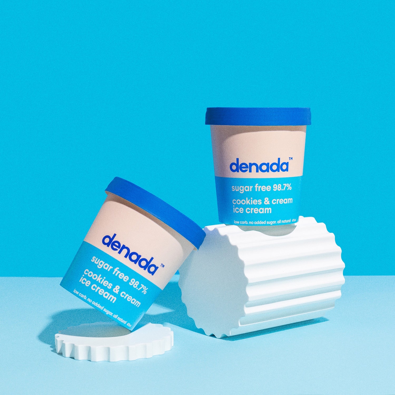
2.Upfront Nutritional Labels
Everyone checking out the ice cream aisle has nutrition on their mind—even if just for a fleeting moment. Consider Denada Ice Cream’s bold approach. They showcase their “low carb” and “no added sugar” claims front and center, turning nutritional strengths into key selling points.
This strategy works great for brands targeting health-conscious customers and helpswith product display. Seeing those eye-catching health facts directly on the front of the packaging can build instant trust and give your ice cream an edge in a crowded market.
3.Nostalgic Style
Think old-school diners, classic flavors, and maybe even a cartoon mascot. A nostalgic style for your ice cream packaging taps into that warm, fuzzy feeling. It suggests your flavors are simple and timeless, reminding customers of summer days and a more carefree past. If you want tofind great patterns or icons for a nostalgic design, take inspiration from old-fashioned soda fountains or vintage ice cream parlor menus.
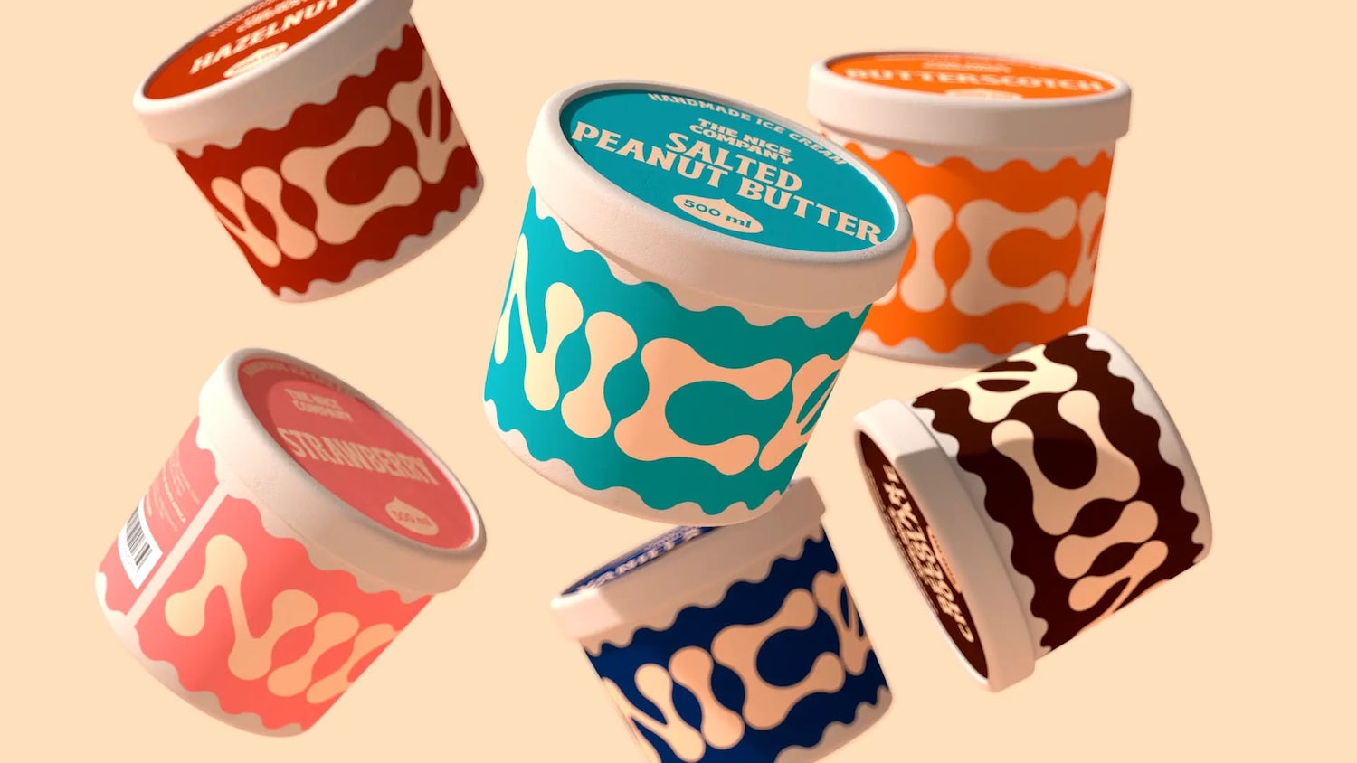
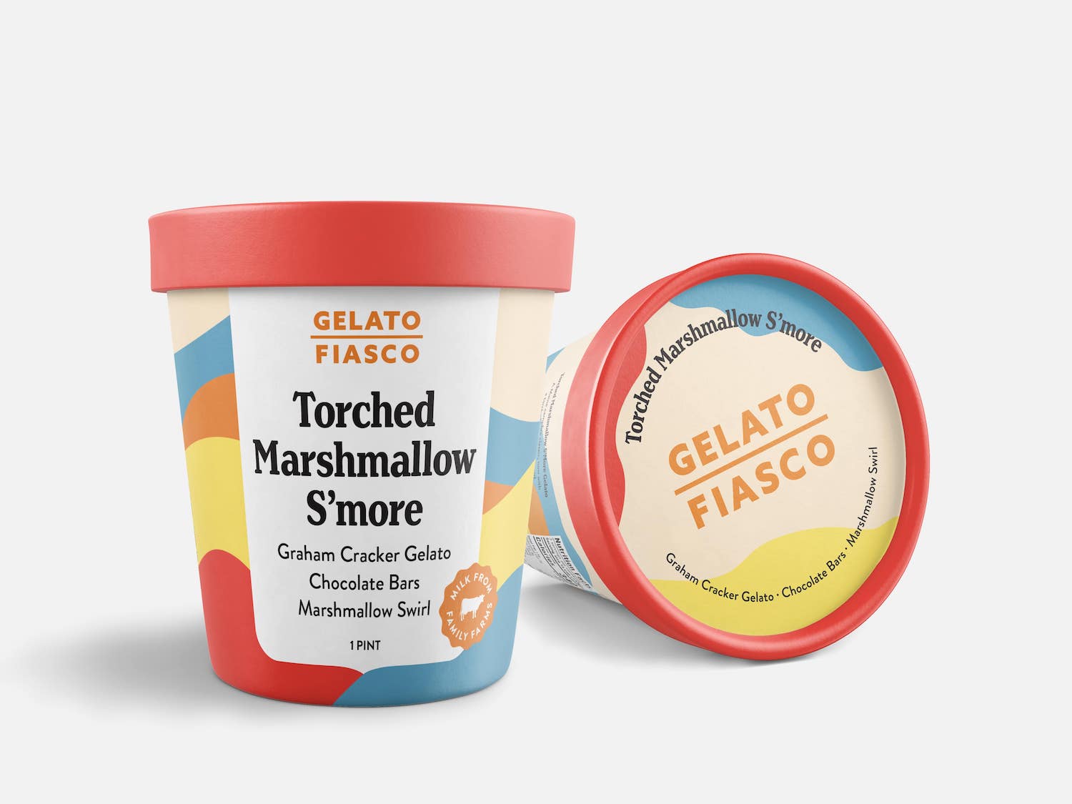
4.Organic Color Blocking
Consider organic color blocking to give your ice cream packaging a modern look. This style is perfect for everything from pints to popsicle wrappers. The flowing lines, catchy color combinations, and unique shapes give the design a natural, wholesome vibe.
This aesthetic is especially effective for brands that evoke a sense of simple, farm-fresh goodness. Imagine swirling blocks of creamy vanilla bean contrasted with splashes of strawberry or deep chocolate—it’s an instant way to make your ice cream stand out on the shelf.
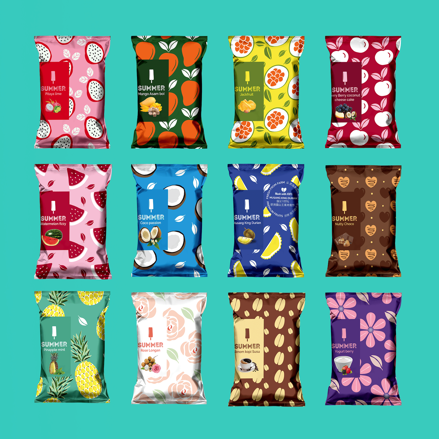
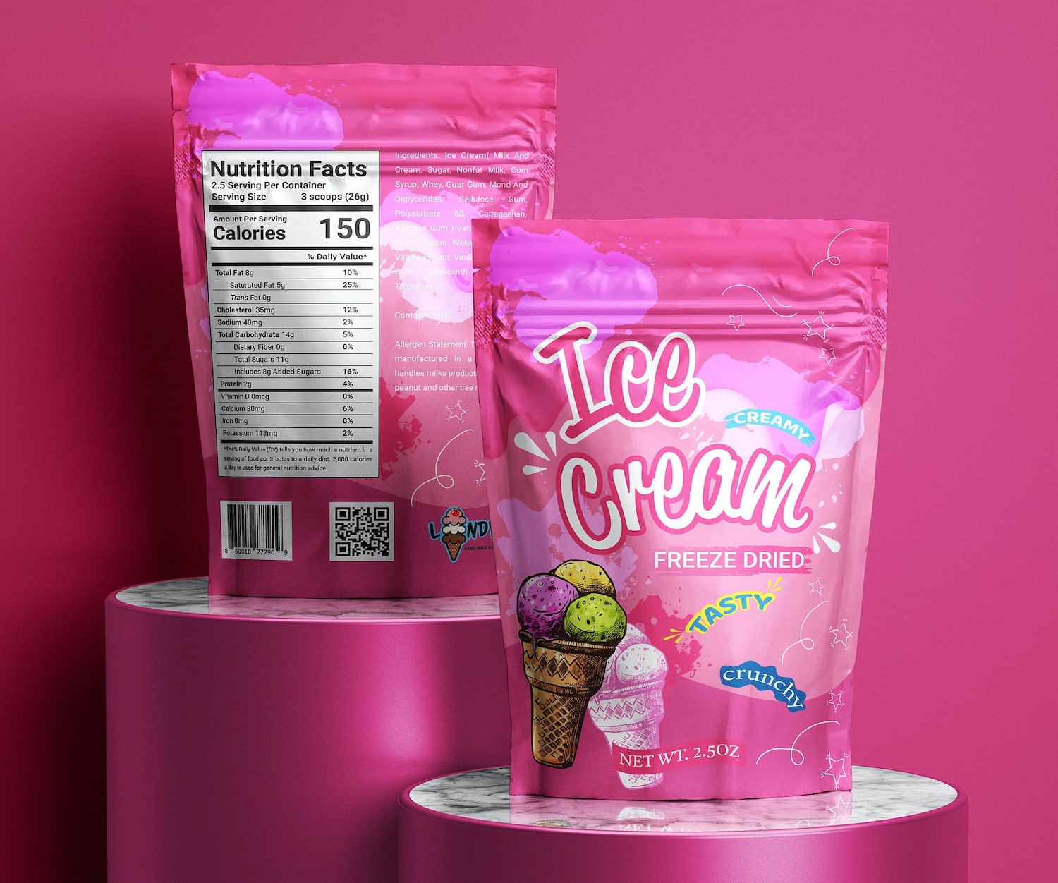
5.Imaginative Prints
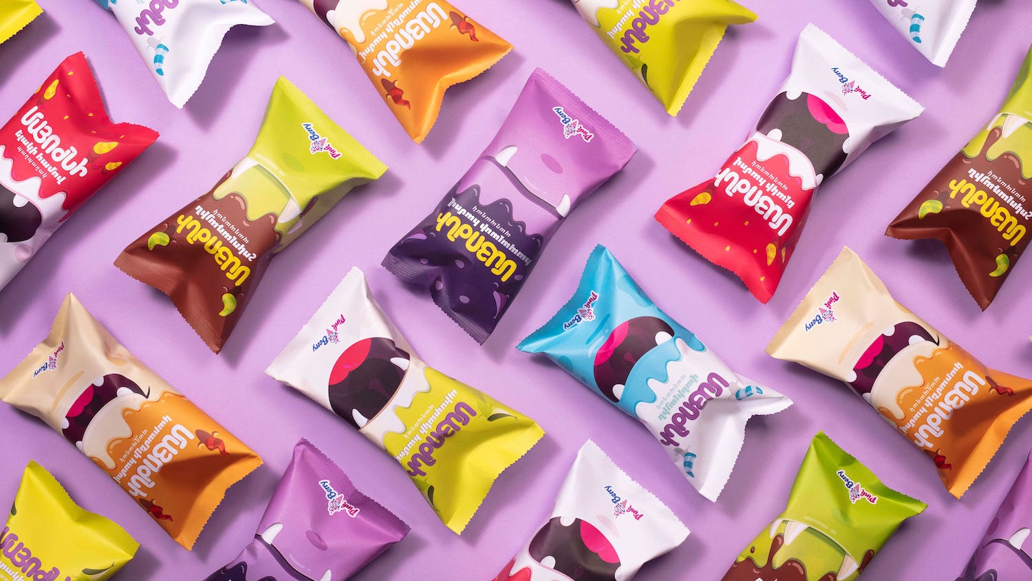
Quirky prints instantly inject entertainment into ice cream packaging. They’re guaranteed to capture attention with energetic colors, whimsical patterns, and unique illustrations.
Imaginative designs offercreative packaging solutions and are incredibly versatile. Think dancing sprinkles, smiling popsicles, or cheerful cartoon characters. They tap into a sense of childlike joy, making your ice cream irresistible to kids and adults alike.
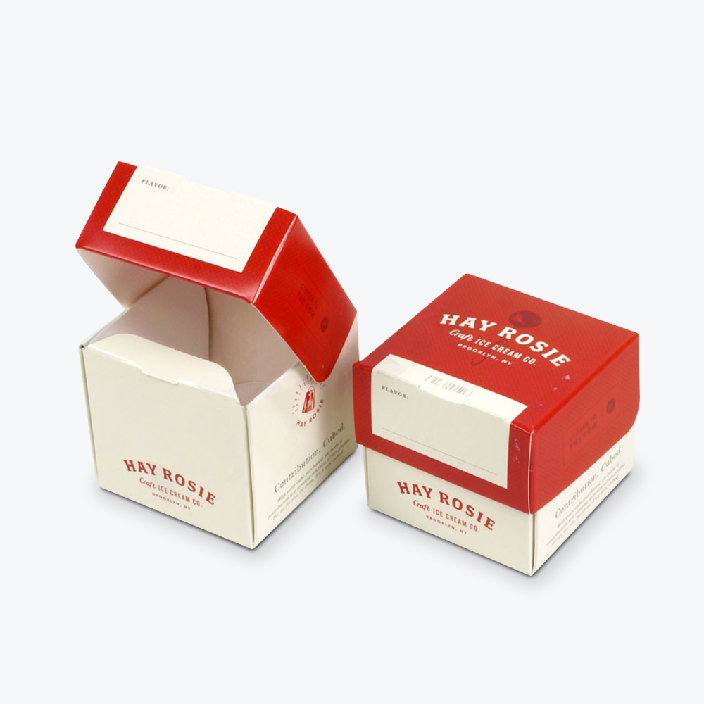
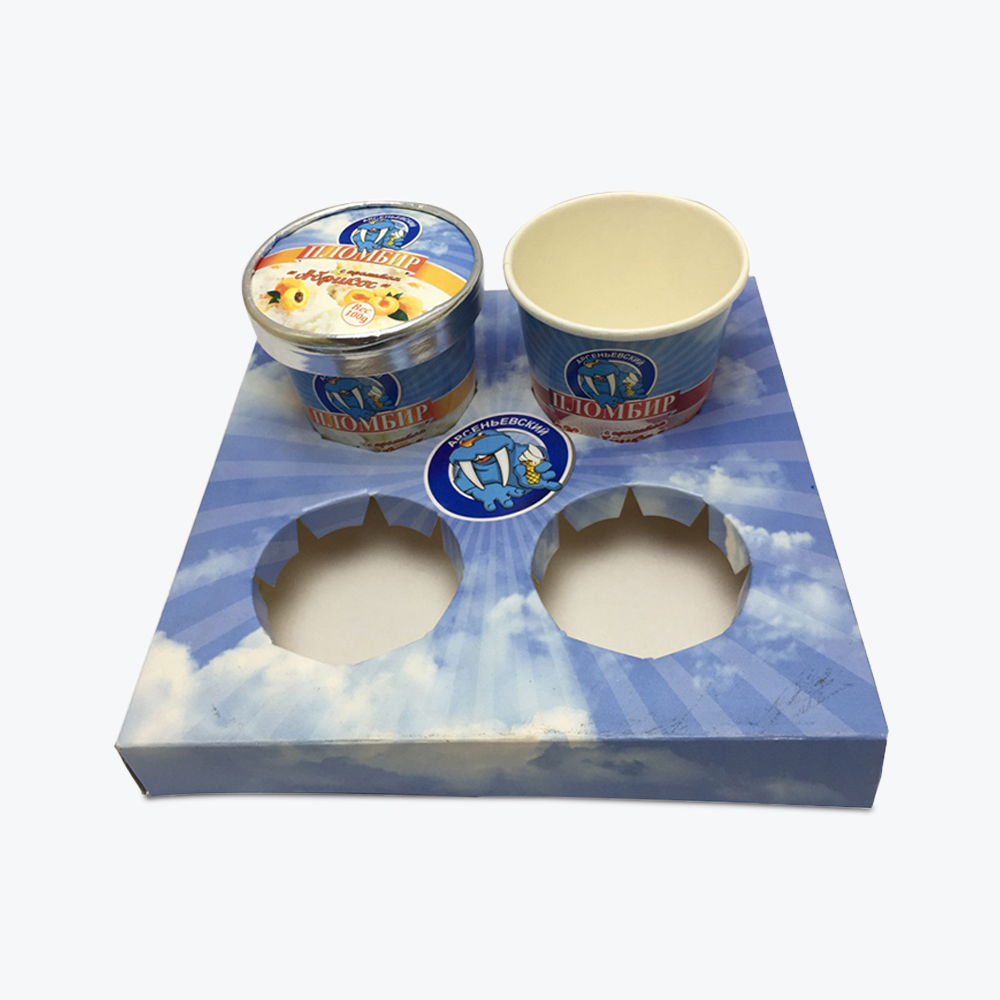
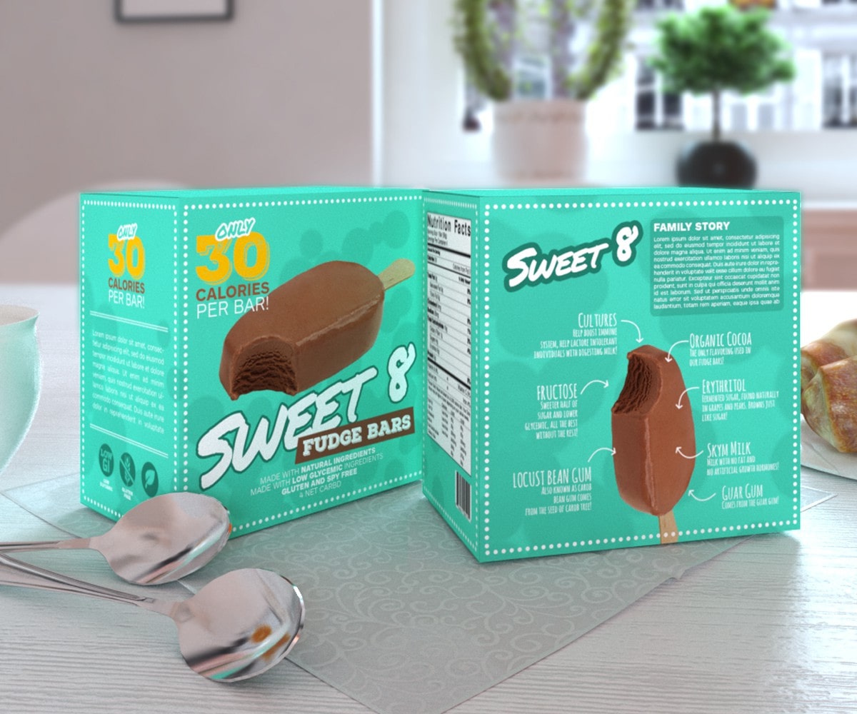
6.Boxed Pints
Boxed pints give your ice cream a classic, nostalgic feel that customers love. Besides their charming look, there are some practical benefits too. Boxes offer a larger surface area for captivating designs and important product information.
You can even go the extra mile by incorporatingwindow patching that lets customers peek directly at the product inside, making it all the more tempting. Boxed pints often feel more substantial and high-quality than other packaging options, offering a little touch of luxury.
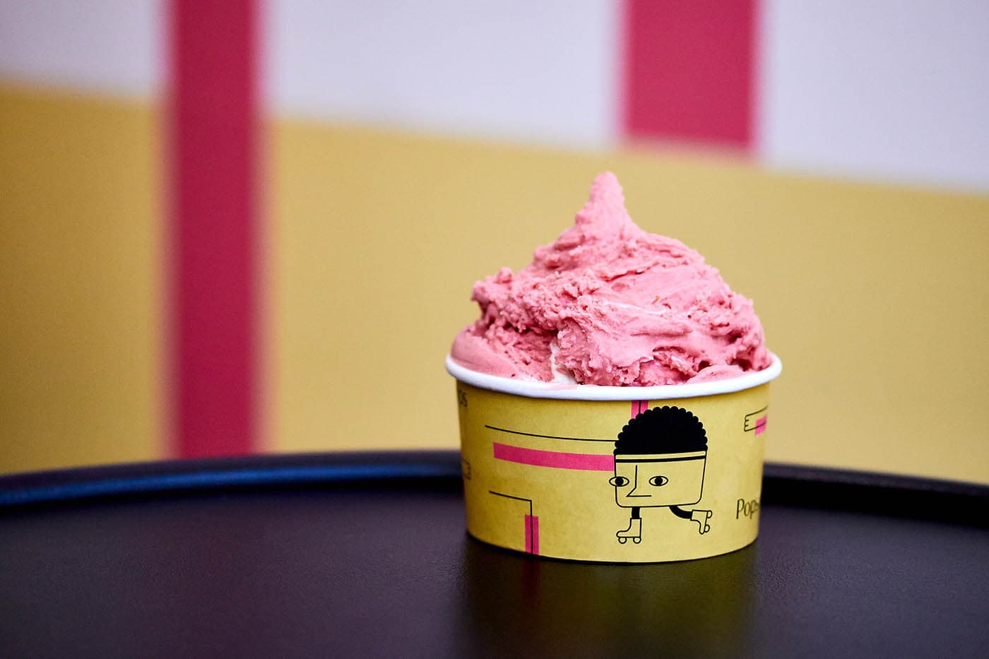
7.A Character for Every Flavor
Want to inject some serious charm into your ice cream line? Give each flavor its own unique character. This approach makes your brand instantly memorable and helps customers build an emotional connection with each yummy option. It’s also a great way to tell a visual story about the ingredients or inspiration behind each flavor.
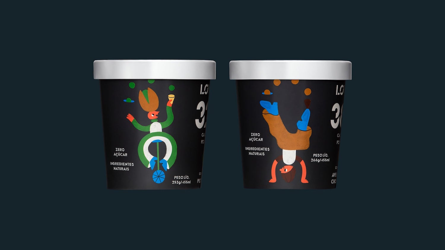
Brazilian ice cream brand Lowko Ice Cream has nailed this concept with a whole cast of adorable characters. One character rides a scooter, another a unicycle, and others stand on their hands. And each character balances heaping scoops of ice cream. This design idea is especially effective for brands targeting kids or those who want to stand out with a bold sense of whimsy.
8.Clear and Transparent
In today’s market,94% of customers crave authenticity and honesty from brands. That’s why clear or transparenteCommerce packaging can be a huge winner for ice cream sales. Imagine directly seeing those swirls of creamy chocolate, juicy fruit chunks, or crunchy nuts through the packaging. That’s incredibly enticing. This approach builds trust because there’s no mystery.
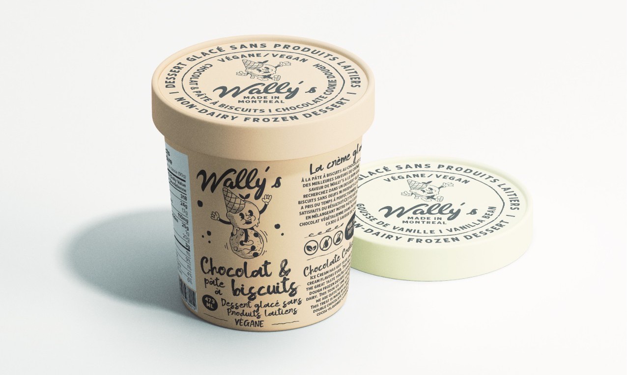
9.Artisan-Quality Visuals
Think hand-drawn illustrations, beautiful typography, and a focus on natural textures. The artisan style makes your product tell customers you value quality and craftsmanship. It’s perfect for brands highlighting small-batch production, premium ingredients, or a delicious, homemade taste. Artisan visuals don’t need to be overly complicated. A simple design with a touch of elegance speaks volumes.
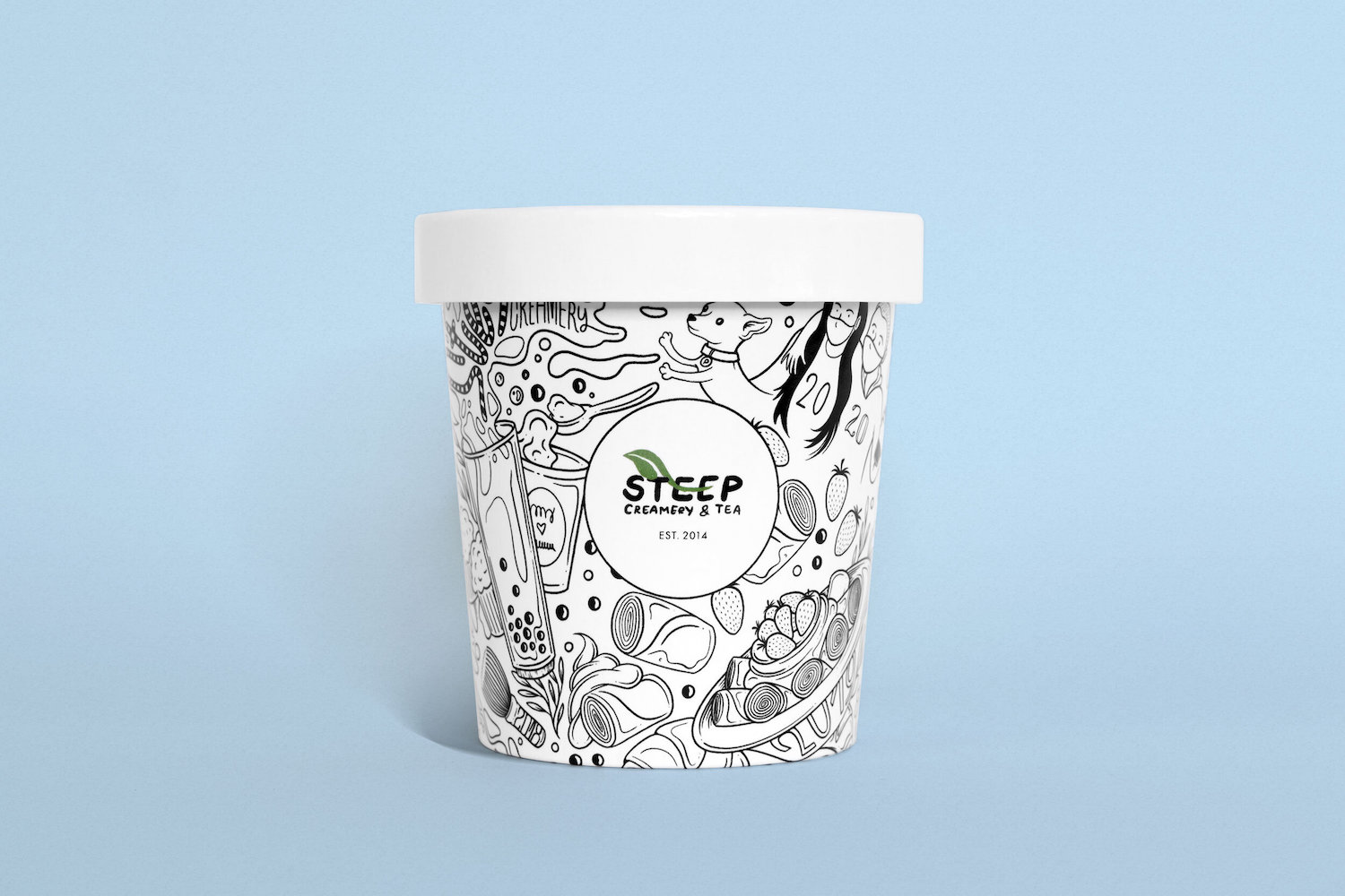
10.Doodle-Style Illustrations
Doodle-style illustrations with a friendly, hand-drawn look add a sense of lighthearted nostalgia. Imagine sprinkles, scoops, waffle cones, and happy faces sketched in a loose, doodle style. Doodles are versatile and can be customized to fit any flavor or theme. You can incorporate fun characters, whimsically depict ingredients, or even tell a little story about your ice cream.
11.Blend of Traditional and Modern Design
Consider the charm of vintage ice cream packaging, such as classic colors and simple fonts, and incorporate modern elements like bold shapes and clean lines for a captivating look. It’s all about finding harmony.
Combine a modern font with a vintage-inspired color palette, for example. Or perhaps opt for a bold color scheme on your tub, then add a touch of old-school charm with a retro logo. Mixing and matching design elements need to be restrained, though. Limit yourself to two contrasting design elements to avoid a cluttered look.
Ice Cream Packaging: Scooping Up Success
Creating ideal ice cream packaging balances creativity, practicality, and brand identity. Put yourself in the customer’s shoes. Would this package make you want to try a new flavor? Does it look like the ice cream inside is high-quality? Does the color or font make the ice cream brand memorable?
The most important thing is to let your ice cream’s personality shine. Whether you use quirky designs, a handcrafted look, or a transparent container, great packaging should give customers a hint of what makes your ice cream special. Get creative and have fun.
Refine Packaging is the top choice for 1000s of small businesses, Inc 5000, and Fortune 500 companies alike when it comes to custom packaging boxes. With super fast production times, affordable pricing, and a sky’s the limit attitude, we’ll help you turn your custom packaging into a competitive differentiator.Contact us and a dedicated packaging specialist will guide you through every step of the custom packaging process without breaking a sweat. Give us a call for professional help oncustom ice cream packaging boxes today.
Erica is a professional writer and brand strategist at Refine Packaging who is based in Denver, Colorado. With a background in writing and journalism, Erica entered the manufacturing industry 8 years ago to deepen her passion to demystify difficult packaging concepts. With years of in-the-field printing experience, Erica is uniquely suited to help unpack the custom packaging process for beginners looking for an impactful box style that resonates with their target audience. When she’s not writing, Erica can be found with her nose in a fantasy novel or climbing The Rocky Mountains (and sometimes, doing both at the same time).


 Alex Jasin

 Amanda Jane Rivera

 Asif Muhammad

 Erica Campbell


.svg)
Share